As the spooktacular Halloween season arrives, it is the time to amp up your spine-tingling sends and get it delivered right into your consumers’ inbox. Be it ghosts or ghouls, Halloween email campaigns are all about having fun and conveying the boo-tiful spirit.
But, should every brand be sending Halloween emails? Well, yes! Your brand needn’t be a ‘Halloween brand’ or sell “Halloween inspired products” to take advantage of this occasion. Plus, as soon as the calendar hits September, Halloween is already in people’s minds and your marketing strategy should be geared up for another wave of email marketing.
However, If you’re still not sure of what is the right way to put together a stellar Halloween email template, you are in for a treat! Like always, we understand what it takes to build a hair-raising Halloween newsletter with some killer designs. We have rounded up some design tips and examples from real brands to help you leverage this season, even when you don’t have Halloween-y to offer!
But, before we move on to learning the Halloween Marketing tips and tricks, let’s look at the real reason behind why you should make most of the Halloween season.
Why Should Your Brand Leverage Halloween Email Marketing?
As the Halloween spirit approaches, Email Marketing is definitely the most effective marketing channel. Don’t believe us? Let’s look at the statistics to figure out the truth.
Halloween provides you with a massive retail opportunity, as it is one of the celebrated family-friendly holidays with people adorning different costumes. Unlike Thanksgiving or Christmas, Halloween is without any of the expectations, but it can still add quite a lot of purchase amounts to your profits if used the right way.
Let’s check out some stats of Halloween celebrations from the previous years:
- 68% of adults expect to celebrate Halloween
- Total consumer spending at Halloween is expected to reach $8.48bn this year
- The average spend per adult is slightly over $74; this year it will be $82
- 36 million children take part in Halloween celebrations in the USA alone every year
- Halloween sales are worth $2.08bn in confectionary alone
By now, you know why Halloween is a great opportunity to score some big bucks, let’s build on some really crazy and spine-tingling sends to encourage purchase and engagement from your customers.
Here are ten best practices to BOOst your Halloween email marketing and ramp up your revenue game!
1. Focus on a Clean Design and Product Placement
Everyone loves to look at clean design, but with too many products in place, your template might look all cluttered. Fortunately for you, the TargetBay drag-and-drop email design platform makes it all easier. All you gotta do is, choose the best Halloween template that works for you, add deets, and connect with your audiences.
Example: ATG, a furniture to lighting company makes use of a well-structured Halloween email template layout that not only allows you to feature a plethora of products but can allow you to feature a lot of products without creating any clutter.
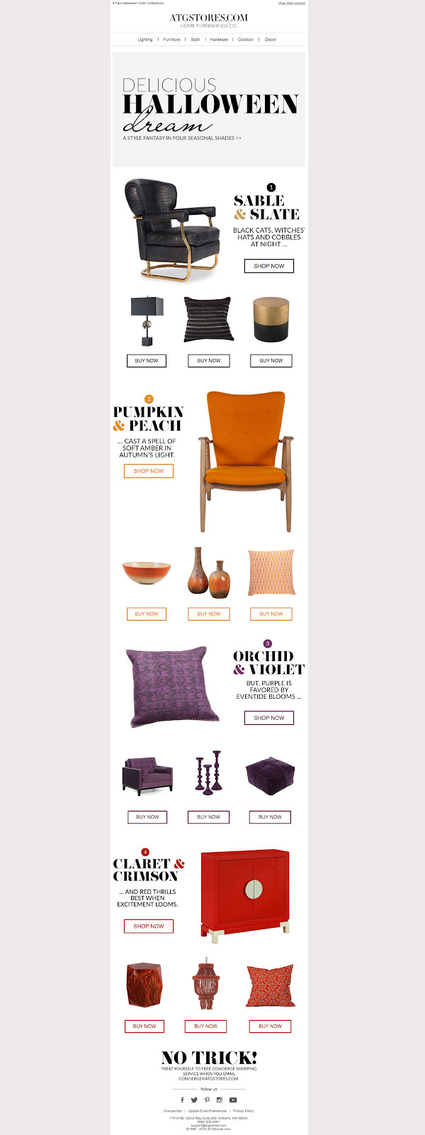
Simply put, organization and decluttering your design template is the key. In the above example, all the products are organized with a color theme (Halloween theme) in mind with a killer subject line that already announced it – “These 4 colors ARE Halloween.”
Bonus Tricks!
- Try to have a color scheme in place that fits the occasion and without moving further away from the brand identity.
- A subtler approach on color scheme and designs helps keep your brand identity in place. Thus, if you don’t want to put up cobwebs and witch-hats, fill the email with small details and copies that evoke the feeling of the Halloween spirit.
- Keeping your design clean by making sure all the CTA buttons are of the same size, you use the same number of products, etc. for the layout would help you pull off a better task.
2. Simplicity is the Key
Sometimes, the simplest things help you to attract the best. After all, legend says simplicity is the key. Plus, a lot of effective Halloween email campaigns are the most simple and basic ones that one can probably imagine.
Now, if you ask why the email should be simple? It’s pretty simple (pun intended.) Your email marketing content needn’t look like your brand website stuffed with content and that in the end overwhelms your customer. Your emails should be filled with intriguing content that grabs your customer’s attention and gets them clicking and purchasing!
Here’s a great Halloween message from Grammarly, even when they don’t have a ‘Halloween inspired product’ to offer.
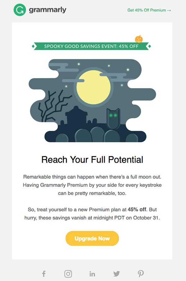
This Halloween email is effective as it is crisp, short, sweet, and has got everything needed to make a stellar Halloween email newsletter. Look closely and you would find a hero image, killer header, a crisp content in the section of body text, and a prominent CTA. Some thoughtful illustration and an intriguing copy are enough to draw the attention of your customers to celebrate the Holiday with a sale.
Bonus Tricks!
- You can always add Halloween freebies to the email to make it more intriguing.
- Plus, to make it more clickbait-y and offer trial periods that could be redeemed by consumers.
3. Get Creative with Your Designs
The design elements in your Halloween email template designs can either make or break on how well it performs. So, instead of including the regular standard product images to your designs, get creative to keep up with your user’s attention. Here’s an example from Paperless Post that showcases how to cleverly stage your products and think out-of-the-box product placements.

Similarly, like the other previous examples, ATG and Grammarly, the Paperless Post Halloween email template is also less on the text. This email has a crisp header, a catchy line of copy, and a brilliant call-to-action. Plus, using a distinctive image does it all for you.
But to put on a great image, you might need to spare some extra bucks and time on creating better visuals. However, if you’re short on both, there are plenty of free digital tools to help create a flattering Halloween email marketing.
Bonus Tricks!
- Don’t focus on making your email with just one image as it can turn a major roadblock if there’s a low-power internet.
- Focus on making bulletproof CTA buttons and not image-in-emails.
- Never forget to add ALT text so that it gets you the clicks.
4. A Clear Design Hierarchy Works like a Charm
Imagine this: if the first image in your Halloween email template grabs your user’s attention, then nothing can match that up with any other trick. This spooky email from Food52 just kills with their direct use of the hero image.

Here’s a look at the full email from Food52:

The GIF with a monochromatic look is a superb hero image to use just to grab eyeballs. And, if you look closely, the image hierarchy is superbly established in this email. Here, the largest GIF image is followed by secondary content that is also divided into various columns which in turn allows the users to look at messages quickly on the go.
Bonus Tricks!
- Use of animated GIFs can actually do wonders for your Halloween email templates.
- Establishing an image hierarchy will help you streamline the email better.
- Dividing the Halloween email into multiple columns will help your customers scan through even on the go.
5. Chuck the Clutter
Take a quick glance at this Halloween email from Tattly. What are your thoughts?

The email looks great, right? Why do you think so? Is it because it’s super bright, simple, and modern or, is it something else? Well, magic is the use of white space.
Here the email uses a lot of Pumpkins to evoke a traditional, country vibe along with also keeping the Halloween spirit alive. However, if you look closely, you would find that the Pumpkins are tattooed. This email also leverages white space like no other Halloween email, that elevates the aesthetic of the email from a traditional look to a sleek style.
Bonus Tricks!
- Reinforce the use of white space to help make the email clutter-free.
- Smart design planning will yield a Halloween email template that looks fresh and well-lit.
6. Bulletproof CTA’s
This fabulous Halloween email template from The Honest Company gets a lot of tricks right and it makes all the more sense to follow and get inspired.

Bonus Tricks!
- This Halloween email design employs individual bite-sized pieces of content, one at a time.
- Each section follows an inverted pyramid layout: image, header, text, CTA. And the CTA buttons are just right—they contrast clearly against the white background, leverage the “isolation effect,” and use action verbs.
- The buttons also pass the squint test: if you step back and squint your eyes, the buttons can still be clearly identified. Like the remaining emails in this post, The Honest Company’s message is another great example of simple design, minimal text, effective layout, and—most importantly—clear calls-to-action.
5 Spook-tacular Halloween Email Examples And Why it Worked
Halloween emails and newsletters offer brands and organizations a great way to connect and engage with your audience that only helps to ramp up your sales during the holiday season. Plus, industry examples are a great way to understand and learn the nitty-gritty of Halloween marketing to eventually apply and BOOst your sales.
We have rounded up a few of our favorite industry examples that can definitely inspire you to craft your one halloween email or newsletter template!o
1. Harry’s
Subject line Used: Ding dong! Herewith tips, tricks, and treats
The subject line used by Harry’s marketing team is a classic example of telling your audience that your brand is at the door. Plus, it also plays off well as trick-or-treater is always at your door with a hope to be treated. Here, the use of classical characters and the how-to trope definitely nails the magic. The super creative content also makes it all the more interesting for more customers to stay invested and finish the read. While the design aspects are on point, they still lack a few things like the dominant CTA, that would have changed the entire game.

2. Crocs
Subject line Used: Croctober is here. Halloween is near!
This subject line is catchy because it plays off the month by adding their brand into it, making an aspect of the season unique to them (October + Crocs = Croctober). While taking this exact path is probably not ideal for every brand, it’s another instance of taking something not particularly Halloween, and making it in line with the spirit of the season.

3. Dunkin Donuts
Subject line Used: Click Your Treat and Earn 3X Points
The subject line even plays off of Halloween by making you think of a doorbell, the classic sign that someone is at your door. During Halloween, that means a trick-or-treater is at your door, hoping for a treat. This is another great example of how to use creativity and create an opportunity with a clear understanding of your audience. Dunkin’ Donuts took the advantage of offering freebies like this clearly stated Halloween offer. Plus, they also entice consumers to fall in the trap of creating an account to ultimately reap the benefits of the Halloween offer. However, the one thing that the email lacks is visual appeal but it still sticks to the core brand theme.

4. storEDGE
Subject line: Get an Amazon gift card from storeEDGE
This Halloween email from storeEDGE just gets straight to the point playfully. The copy stands out as it rings a bell at the people’s ear at this point of the year. Plus, they also put out a known trope – giving out freebies like a free Amazon gift card to entice consumers to open the email. After all, that’s what your subject lines are for. Although the subject lines and CTA’s are in place, the backdrop lacks the Halloween essence. If it had been a little more inviting or playful that was in and around Halloween, it would have been a great Halloween email. Plus, they also didn’t elaborate on why you as a customer should take up on their offer. This would have eventually helped to convince the customers who were still undecided.

Why is it so sweet?
5. Canva
Subject line Used: Get into the spooky spirit!
Simplicity is the key to a more effective Halloween email newsletter. Here, Canva has been able to pull the right strings to weave a simple Halloween season (without even uttering ‘Halloween’ once). Plus, they also use a friendly tone to leave a lasting impact without constant picking your brain over reinventing the design wheel.

How to send Halloween emails with TargetBay?
Step 1. Head over to the TargetBay website and then login to your account.
Step 2. Next, all you gotta do is drag and drop different Newsletter elements to create a template, and then, customize the various aspects according to your liking.
Step 3. Import your email list and decide the frequency of the emails. Voila! You are done. Your ‘Ghoulish but Spooktacular’ Halloween newsletter away.
Now that you have got an idea on how to design a Halloween email template – it’s not so tricky now, is it? We’re sure, you would be relieved when you take advantage of tools like TargetBay.
The Bottom Line
Although Halloween won’t probably generate mucho unero like Christmas or Valentines’ Day, it’s still worth your time. It provides you a huge opportunity to get in front of your consumer’s mind so that they think of you when the Holiday season approaches. Plus, it also helps to shape your brand personality. And given that your Halloween email designs can either make or break your sales, these 6 tricks can actually help you nail it!
However, if you’re still awry of all the work, get in touch with TargetBay to get assistance and create easy and some Boo-tiful Halloween email templates in no time.


