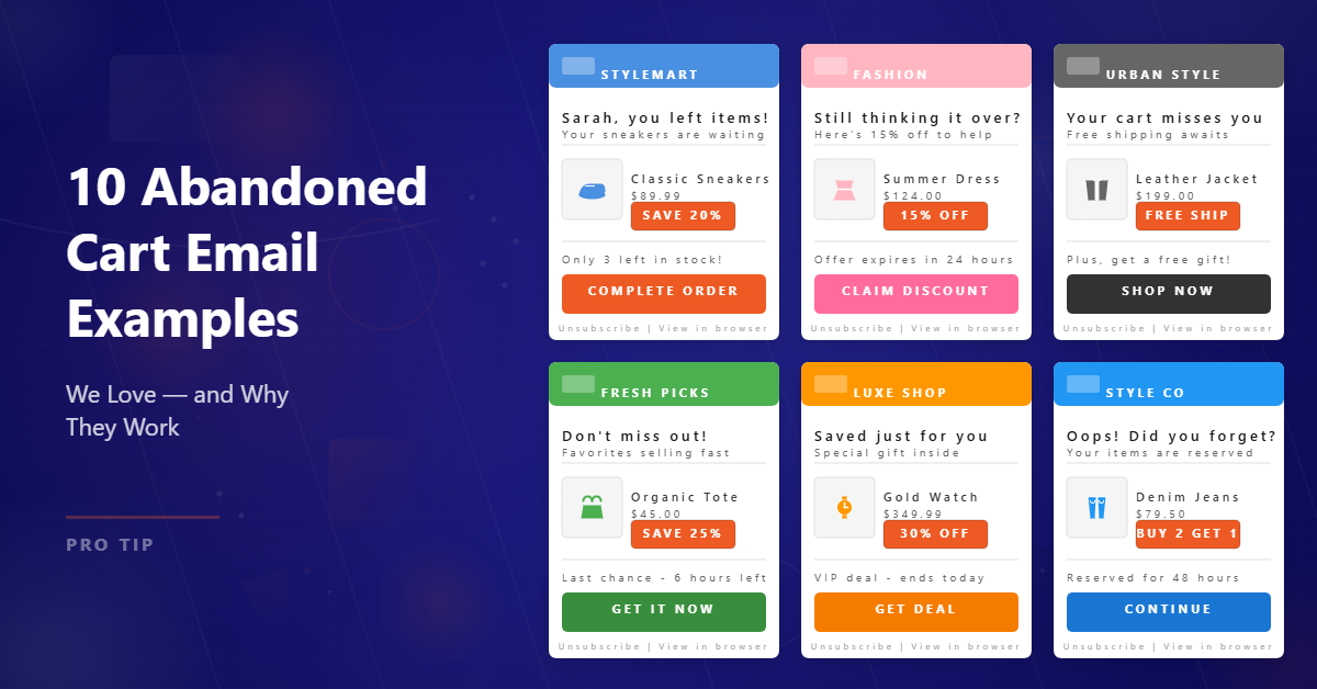
Nearly 75.6% of people abandon their carts while shopping online.
That’s a huge number of potential customers that you just lost. But there is a way to cut down these numbers and bring back these shoppers complete the purchase; cart recovery email strategies.
Abandoned cart emails or cart recovery emails have an open rate of 45%, which is nearly three times that of a mere 15% open rate of a usual eCommerce email. This only goes to say that online shoppers don’t mind being reminded of products they may have left behind.
So, what makes these mailers tick? Does every cart recovery email lead to conversions?
Let’s look at some of the best cart recovery emails that we have come across and tell you exactly why they work better than the rest.
Abandoned Cart Email Playbook
Turn abandoned carts into revenue with plug‑and‑play recovery flows, timing templates, and copy frameworks for ecommerce brands.
Cart Recovery Emails We Love and Why They Work
The best abandoned cart recovery emails are the ones that show the product and encourage visitors to revisit their carts and complete the purchase.
It may sound simple, but it requires a few tricks and tactics that entice the shopper all over again. You’re competing with a lot of other cart recovery emails, after all!
Here are some brands’ abandoned cart email examples that we have liked, and you can take a cue from for your recovery emails.
#1 Cart recovery email: Lime Crime
Offering a discount on cart items is a double-edged sword. While a lower price may encourage the customer to purchase the cart item, it may also decrease the value of the brand’s product or service. This can further propel the customer towards habitual cart abandonment to receive a discount.
So, how can you create a cart recovery email that does away with these risks? Take a cue from this Lime Crime emailer. Play on the psychological factors. Send repeat single-use coupons to the customers who have proven their loyalty and have used these discounts in the past to convert their carts.
You’d also want to take a look at the email sequence. Use your discount code cleverly; place it in the last email. Word and design your email in a manner that you offer them a discount as the last strategy.

However, we wish that this cart recovery email by Lime Crime were more mobile-friendly and less cluttered in terms of design.
#2 Cart recovery email: Quip
There are many ways to convert an abandoned cart, even via email. But, using all the options together would be like putting all your eggs in one basket; risky and overwhelming.
That’s where this cart recovery email by Quip wins the race. It is simple, using brand colors and fonts, with a single call-to-action placed neatly at the end of the email.
This email, in a way, translates the confidence of the brand in terms of the value it brings to the shopper. The copy is simple as well, using fun puns to gauge the interest of the customer, with a no-pressure policy involved.
Even when there is no apparent discount being offered, a subtle reminder that their order would include a free refill is clever. It tells them that they’re getting more for less!

#3 Cart recovery email: J. Crew
Another example of simplicity in an abandoned cart recovery email is J.Crew’s email.
The brand exudes class and confidence, and the same reflects in the email as well. They know that their product is enticing and deserves all the accolades. In a simple and classy email, they place the product right at the center and nudge the customer not only towards the product but also towards their new arrivals, ongoing sale, and other personalized recommendations based on their last interaction.
The best part about this email is that it mirrors the design of the website and brand, giving the customers a sense of familiarity. It also appeals to the recall value of the customer’s memory so that they can feel the exact emotions at the time of placing the product in their cart, while purchasing it.

Abandoned Cart Email Playbook
Turn abandoned carts into revenue with plug‑and‑play recovery flows, timing templates, and copy frameworks for ecommerce brands.
#4 Cart recovery email: Pacsun
The most important aspect of creating any brand communication is knowing who you are addressing, i.e. your target audience. Know whether or not you can get a little cheeky with them, obviously being in sync with the brand language.
Like this email from Pacsun.
It does not assume the position of the customer (You forgot something!). Instead, it makes a simple statement that they may have left something in the cart and may want to check it out.
At the same time, Pacsun creates a sense of urgency by mentioning that its products tend to sell out quickly.
But what we like the most about this cart recovery email is how they include their contact details. This shows the shopper that the brand wants to help them make an informed purchase by helping them out.

#5 Cart recovery email: Madewell
Madewell speaks of class and elegance. It can be seen in their cart recovery email as well. The content and design speak for themselves, with a clever wordplay that can extract a chuckle from the cart abandoner.
It starts with a fun pun in the form of the product looking good in the cart, but it doesn’t stop there. The next step is where they nail the statement with their sub-head that the product would look better in the customer’s bag, followed by the product itself and a call-to-action.
Simple and direct, this Madewell email is confident in itself. Just a subtle reminder, and the customer will definitely take a look, and probably follow it with a click and purchase.

#6 Cart recovery email: Puma
The design and colors of an email have an important role to play while convincing the customer to come back to the cart and convert it into a purchase. The catchy and contrasting colors capture the attention of the shopper, the urgency retains it, and the call-to-action helps drive them back to the shopping cart.
Also notice that Puma ensures they have conveyed the message in the first fold of the email. Instead of listing things one under the other, they place them side by side using a clean template.

Abandoned Cart Email Playbook
Turn abandoned carts into revenue with plug‑and‑play recovery flows, timing templates, and copy frameworks for ecommerce brands.
#7 Cart recovery email: Bonobos
This is a great example of minimalism. Minimalist emails with fewer elements and shades help the customer focus on the product, rather than the email, which should be the objective of any good email.
The monochromatic design is a reflection of the latest minimalist trend, and just before the call-to-action, they sign off in style by offering a hefty discount to first-time shoppers.
And don’t miss the pun that is inserted in between to keep things interesting.
The latest trend, incentive, and wordplay, along with establishing loyalty with first-time shoppers, Bonobos makes the most out of their cart recovery email!

#8 Cart recovery email: Hayneedle
What’s better than simply reminding a cart abandoner of the product with an image? Showing the product in use!
That’s where the Hayneedle email takes the cake.
It starts off with an incentive and then goes on to place the product, using an image that shows it being used to highlight the comfort that the couch provides.
They keep the rest of the email crisp and clear, ensuring the only way forward for the shopper is to go back to the site to make the purchase.

#9 Cart recovery email: Away
What is the most important advice that you have ever received with respect to your belongings in public spaces? Never leave them unattended. Away takes advantage of the advice and uses it brilliantly in the email. It states a simple fact: your cart is unattended and unprotected with ‘your’ property inside it.
The customer feels that the product in the cart already belongs to them. It helps that it is a luggage brand, so the product is ultimately going to be a part of such a situation wherein the user, the cart abandoner in this scenario, should not leave it unattended.
It’s like killing two birds with one stone, the stone being the clever use of words in this email.

#10 Cart recovery email: Nordstrom
This email starts with a question. No assumptions, just a good old question putting the customer in charge of the situation. Then, it cleverly places the product and the call-to-action side by side. In the end, it highlights the fact that the returns and shipping are free and all the FAQs that the customers may have around the purchase.
Simple and smart, addressing pre-purchase concerns and bringing them back without offering a discount!

What’s common in these cart recovery emails?
We listed down the cart recovery emails that are sure to catch the attention of the shoppers who abandoned your products. But what makes them all click?
Here are some of the common factors that make all these cart recovery emails lead to actual sales:
- Incentives and discounts, whether for a first-time consumer or otherwise
- Low-commitment call-to-actions that put the ball in the court of the customer
- Simplicity and clarity
- Personalization in terms of addressing the customer
- A sense of support, in case the customer needs help in completing the purchase
- Cross-selling and up-selling
- Being true to the brand persona in terms of content and design
- The knowledge of the target audience and using contextual language
- Using reviews and testimonials as social proof of the quality and experience your products deliver
- Creating a sense of urgency by showing the said cart item is a fast-selling product
- A clear picture of the product that reminds the shopper of what they’ve left behind
Abandoned Cart Email Playbook
Turn abandoned carts into revenue with plug‑and‑play recovery flows, timing templates, and copy frameworks for ecommerce brands.
Create a convincing cart recovery email for higher conversions
These cart recovery email examples and tips can get you only so far. Now it’s up to you to bring back your lost sales!
You don’t just have to understand what might motivate the shopper to complete the purchase, but also how you’re going to make it look enticing.
And the first step to that is finding the right cart recovery email template.
You need a variety of templates that complement your creative sense and, at the same time, are optimized for conversions.
The app offers many ready-to-use templates for cart recovery that can be customized to match the look and feel of your brand.


