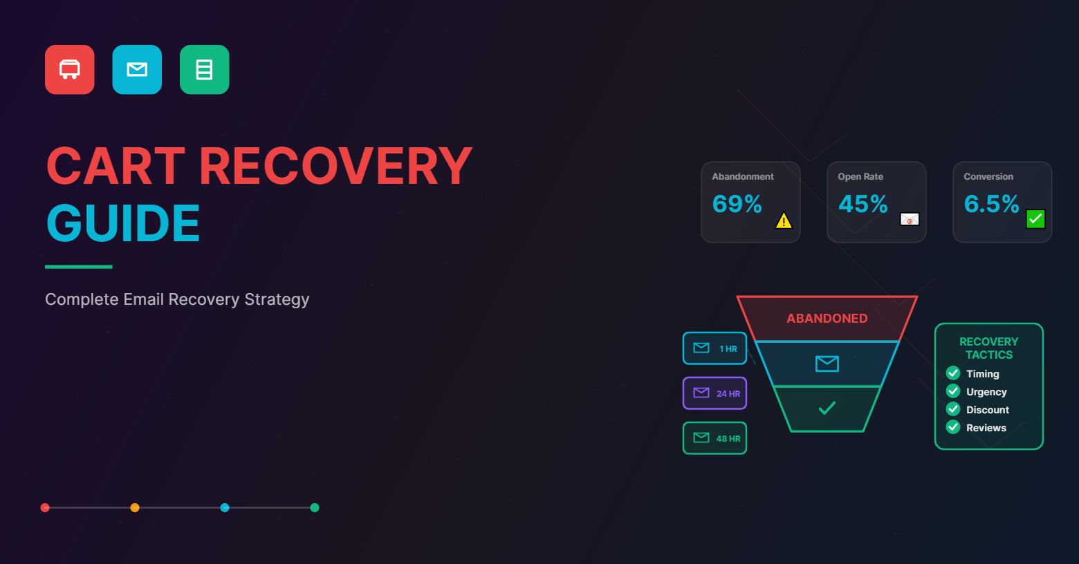
Do you know that the average rate of cart abandonment across various eCommerce stores ranges somewhere between 69 to 90%?
That’s losing more than half your potential sales that you spent hundreds or maybe even thousands of dollars trying to acquire.
Customers may like a product, add it to their cart and even start to check out. But most of them tend not to complete the purchase.
The reasons are many reasons for cart abandonment.
With more and more eCommerce platforms out there, customers have a lot of options to take their pick from. Other than that, reasons such as your shipping costs, delivery time, cart total, the extensiveness of your checkout process, and other things might factor in.
There is a way to bring these shoppers back and convert their cart into a purchase – abandoned cart recovery emails.
But first, let’s understand what cart abandonment is and why does it happen briefly.
Cart abandonment: What is it and why does it happen?
Shopping cart abandonment refers to an act wherein, during the process of placing an online order, a potential customer adds a product to the cart and starts to check out, but does not complete the purchase. Simply put, they do not complete a transaction on your store.
The ‘abandoned’ product refers to the product added to the cart but does not get purchased.
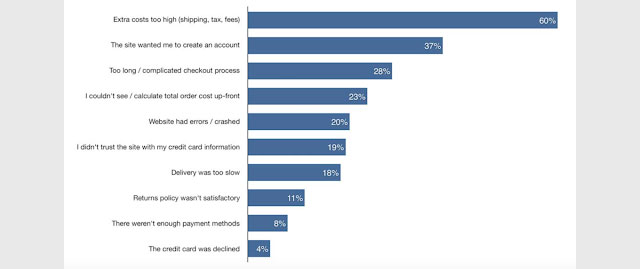
But why does cart abandonment happen? There are multiple reasons for that. Let’s list down a few for your reference in a little detail here:
- High costs
Does your eCommerce store add additional costs such as shipping and delivery charges during the checkout process or at the purchase completion step?
These often do not bode well with the customer. As soon as they see the additional costs, they are likely to change their mind to make the purchase.
The best way to deal with it would be to give all the details on the product page itself. This way, there would be no surprises for the customer when they eventually decide to check out. - Complicated checkout process
Are there many steps involved, from adding the product to the cart to eventually making the payment? That would steer the customer off the purchase route.
Customers want an easy purchase process. Solve this hurdle by making the checkout process easier and by reducing the steps involved. You also need to keep in mind that most of your shoppers are making the purchase from their mobile devices. - Lack of payment security
Do you use a safe checkout and payment process? Customers need a guarantee that once they punch in their payment details, they are secure.
Use a secure payment gateway, use the best fraud management system and follow PCI compliance guidelines to the T. Also, make sure you have trust seals on the respective pages to reassure the customer as they move through the checkout process. - Account creation
Not every customer is interested in creating an account while making a purchase. While we understand you want to know more about them, do not make this tedious process mandatory.
Let them checkout as a guest or use their social media accounts to sign up/ log in. The idea is to make it easy for them to proceed towards completing the purchase. You can always nudge them to create an account later. - Fewer payment options
Offer your customers multiple payment options. Even if you cannot give them ‘pay on delivery’ make sure they have various other options to pay online.
Net banking, Paypal, or credit/debit card, digital wallets, offer it all and let them make a choice. Fewer payment options may force the customers to abandon their carts. A preferred choice of payment, however, makes them stay. - Currency difference
Is your eCommerce website operating on a global level? In that case, you are catering to more than one type of currency.
Lack of local currency pricing is also one of the reasons that lead to cart abandonment by the customers. Make sure to have a currency change plugin on your home page. Determine the customer location using their IP. No one wants to pull out a calculator to make the conversions every time they want to make a purchase! - Costlier products/services
It’s a basic instinct. Put yourself in the shoes of the customer. Will you purchase a product if you get a cheaper alternative elsewhere? The most obvious answer would be a no.
Most customers look for the same product at multiple stores. The moment they find a cheaper alternative, they will abandon your store’s cart. Make sure you study your competitors and your margins well and offer your customers deals that your competitors won’t. - Not a mobile-friendly website
Technology is moving at a fast pace. Customers no longer wait to log in to their systems to place an order. They want quick and smooth interfaces that can help them place the order from their smartphones.
Make sure to prepare a responsive design and template for your store. Keep in mind that the interface should be the same across all the platforms. Only the technical aspect differs so that the customers do not have a different experience every time they log in via different devices.
Think of ways to make completing a purchase on mobile easy, taking into account the smallest things like where you place the ‘checkout now’ button.
Remember that the customers have many options, which is the main reason for cart abandonment in today’s date.
Whether in terms of better user experience, better pricing, or other reasons, they can always hop off your store site and explore the other options available to them.
But the good thing is that once a shopper starts the checkout process, they have shared their email address with you. And that’s where cart recovery emails come in to rescue your sales!
What are cart recovery emails?
Cart recovery emails are follow-up emails sent to the shoppers who have started the checkout process but did not complete it. To put it in simple terms, it is an email directed towards those who added the product to the cart but did not make a purchase. The emails are created to entice such potential customers to come back and purchase what they were so close to buying before abandoning their carts.
These emails work like a nudge. It can be either one email or can be a series spread over 24-48 hours after the shopper has abandoned the cart. These emails comprise various customer persuasion techniques, from offering them discounts to convincing them why they need the product.

Let’s give you a few examples of what a good cart recovery email looks like.
What are some of the best examples of cart recovery emails?
Abandoned cart emails have an open rate of 45%, as compared to an average email open rate of 15%.
This means that even if your customer does leave the cart abandoned despite you tackling all the aforementioned problems, there are chances you can bring them back. But it all depends on how innovative you can get with your cart recovery email.
Example 1: ThinkGeek
ThinkGeek knows its audience well. It caters to the quintessential ‘geeks’ and ‘nerds,’ interested in comics, video games, fantasy, and the literature therein. They use the same while drafting and designing their emails. Their emails totally sell their brand personality.

Example 2: ThredUp
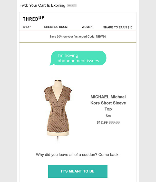
Fashion-forward consumers take a look at gazillions of products before making a purchase. They tend to ‘forget’ a few items that they add to the cart when browsing through stores to see what’s trending. The best way to remind them of what they’ve left behind? Show it to them again, and ThredUp does exactly that!
They keep the email copy minimum, fun, and actionable.
Example 3: Google Store
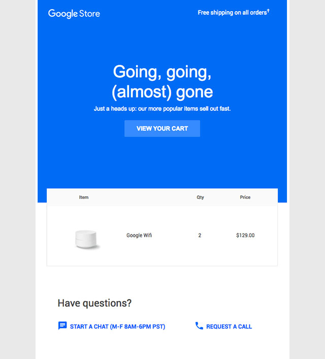
What makes a person act swiftly? The sense of urgency. The same principle applies to the customers as well. This email by Google Store uses the same technique to tap into the customer’s ‘fear of missing out.’ The best way to do it is by creating a lockdown deal or communicating that the product is going out of stock and won’t be restocked any time soon.
Example 4: Vans
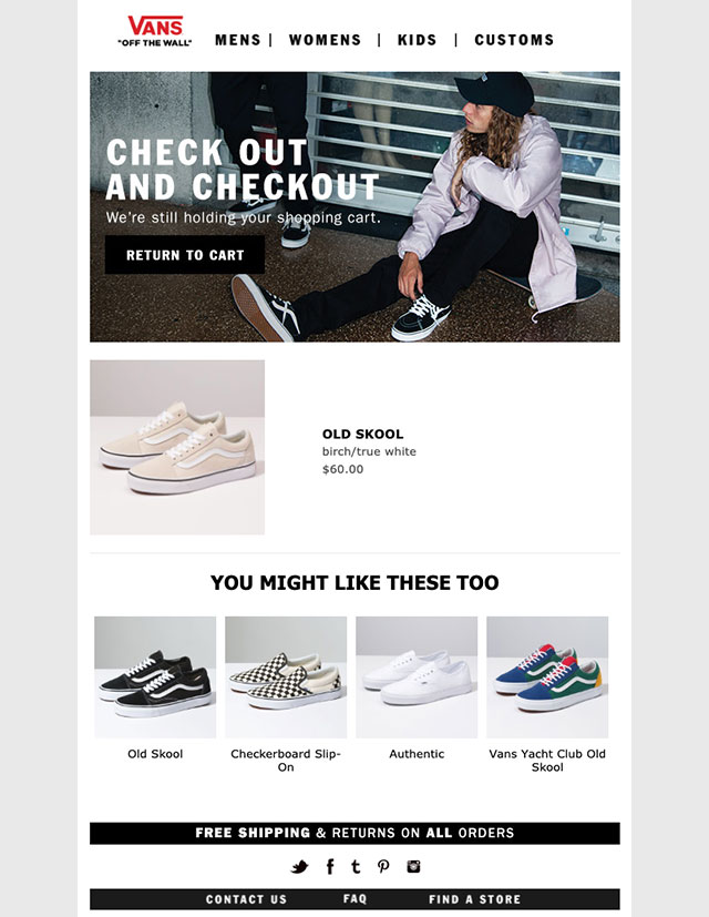
Sometimes, the mere product does not do the trick. Maybe, the customer lost interest in the product and that’s why abandoned the cart. Too many options may have that effect as well.
In that case, an email can be sent out not just with the main product in the abandoned cart, but also with a couple of other alternatives, just like this Vans’ emailer. However, make sure to not overwhelm the customer with too many options too!
Example 5: Whiskey Loot
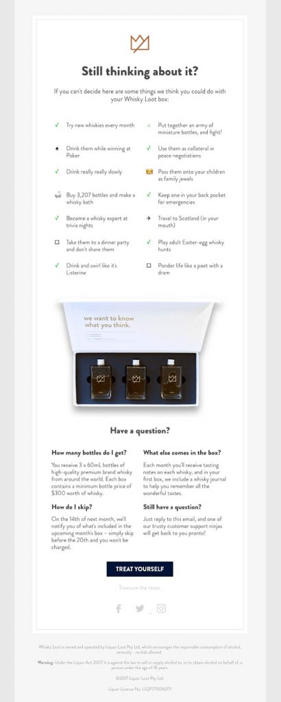
Another way to bring the customer back to the abandoned cart is by helping them realize why they added the product in the first place. This can be done by reminding them of all the product features and utilities, quite like what is done in this Whiskey Loot emailer.
Of course, you can make the email even better by adding a product shot and a call to action, just after the utilities.
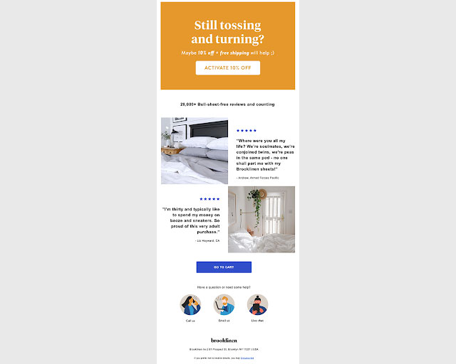
Example 6: Brooklinen
Here’s a fact: 91% of people read online reviews to help them decide whether or not they want to make a purchase.
Your customer abandoned their cart? Use the trick that Brooklinen has used here in this email – customer reviews on the product left behind. Nothing convinces people to buy more than the reviews and experiences of other real people. Let your present customers convert your eCommerce carts for you!
Example 7: Casper
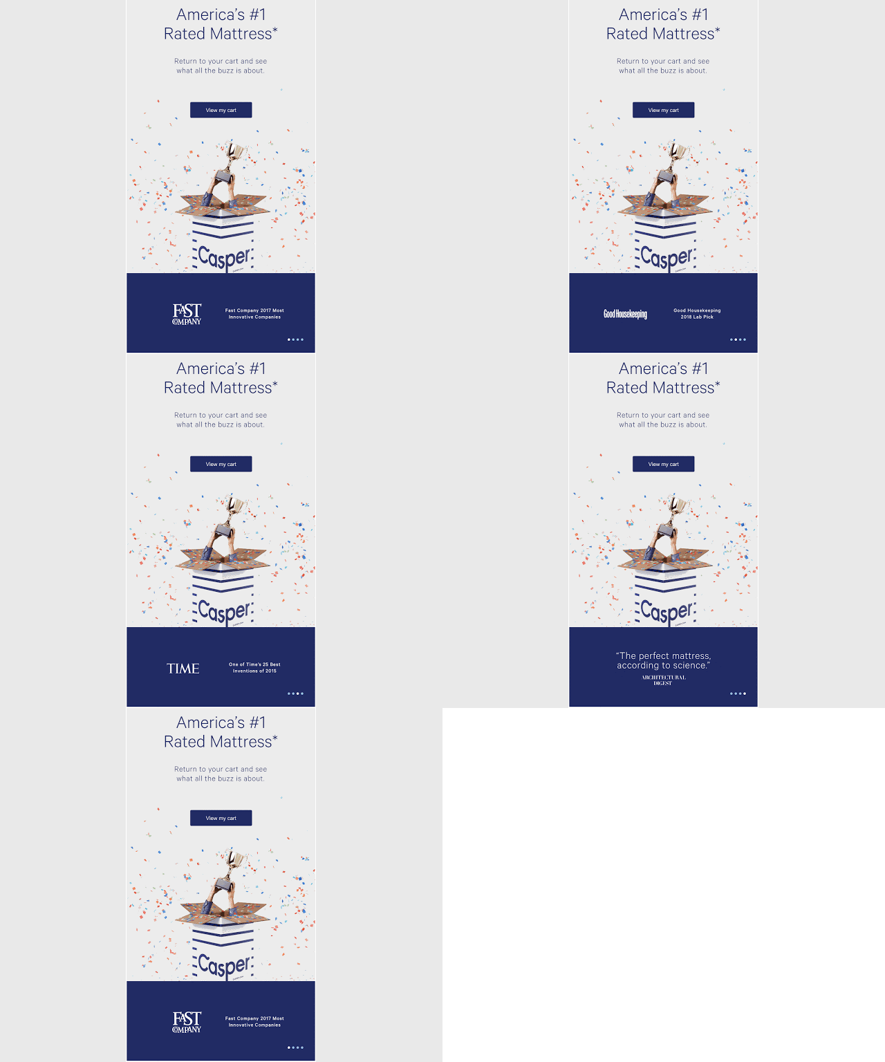
Simplicity and consistency are the two features that Casper uses to tap into the customers who abandoned their carts. But they use a series of emails to recover their lost shoppers.
As you can see, the first email is all about accolades, a simple way of conveying the fact that their product is worth every dime.
But 24-hours later, the emailer changes. This time, there is a discount offered, an incentive to motivate the shopper to make the purchase.

Example 8: SugarBearHair
Media and content play a huge part in converting an abandoned cart into a purchase. Take a look at this email by SugarBearHair. They have placed the product at the center and managed to use quirky, creative, and catchy content to create an overall pleasing effect.
They also give two call-to-actions, one of returning to the cart and the other of completing the checkout process – although they lead the shopper to the same action, they have a different play on consumer psychology.
It’s also good to note the contrasting hues that they use. It makes the product and the call-to-action stand out, separate from each other yet in sync with the brand colors.

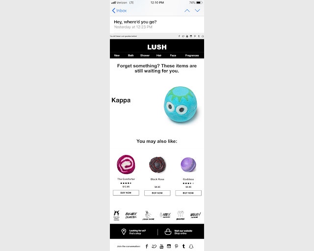
Example 9: Lush
Do you know that Americans check their mobiles at least 50 times a day? That’s a huge number. It is important to create emails that work smoothly on mobiles because that’s where your potential customer is. Take a look at this LUSH emailer. It’s easy to navigate with the bare minimum graphics and content as they go for wordplay. The email should not be heavy and should load quickly. The LUSH email ticks all the boxes, at the same time, also includes product suggestions. There are higher chances of the reader clicking on the call-to-action and completing the purchase.
Example 10: Barkbox
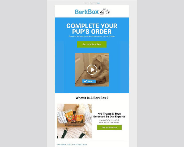
The first step to creating a good abandoned cart email is knowing your audience and using the lingo that they associate with the most.
Barkbox targets pet parents by talking about their little loved ones the way they would at home. They use a GIF of a dog chasing a package, reminding the consumer of the ‘pup’s order’ they have left behind. Cheeky, right?
With a minimal copy and a clear call to action, Barkbox ensures they jog the consumer’s memory of what they were about to purchase as well.
So what did these brands get right in their abandoned cart recovery emails? Each one followed a different path, a different design, and a different tactic.
But there are a few things that every good email needs to check off. Now let’s look into what makes for a good cart recovery email.
How to write a cart recovery email that converts
Our inboxes are choked with messages from work and other brands that we subscribed to or bought from. What’s it that can actually get your abandoned cart email noticed, read, and acted on?
Well, here are a few things that you need to pay close attention to:
- Interesting subject line
Make sure the subject line is clever and crafted well. It should be simple, crisp, clear and should reflect the brand personality. But at the same time, it should sound like a reminder! - Clear call to action
It is essential to place the call to action in the email. It should be placed close to the product and should be visible. Ensure that this button is as interactive on mobile devices as when the email is viewed on the desktop. - Clever copy
Make your copy shine. Use a casual tone, simple and short sentences to convey your message and convince the customer. Think of it as your last chance to entice them into making the purchase. - Create urgency
Nothing appeals to a person more than the fear of missing out on something really good. Online shoppers are just the same. They already like the product enough to add it to their cart. Now let them know how they could be missing out on the deal on it or how it’s selling so fast that they may miss it altogether! - Make the product visible
The customer has abandoned the product in the cart. But they did have an intention of purchasing in the first place. Place the product in the email to appeal to the same sense again. This also works as a good reminder for those who may have lost track of what they viewed on your store while browsing through the other brands. - Create good graphics
“A picture is worth a thousand words.” Not everyone likes to read too much. Keep your content crisp and to the minimum. Let your graphics do the talking. Add cool and catchy elements to your emails like product infographics, GIFs, or user-generated content like your customers using the product. - Use reviews
Add customer reviews to your email, along with the product. Reading real-life experiences is often more convincing than any ad campaign. Your cart abandoner is more likely to trust the recommendation of someone like them than you! - Optimize for mobile
Customers nowadays make most of their purchases via their mobiles. Optimize your store for mobile. You want to ensure that the product image is crystal clear and the call to action button is above the scroll. Cut out on distracting elements that might increase the load time of your email on mobile devices. - Measure the impact
Always measure the performance of your campaigns. Use A/B testing to see how different variations of your cart recovery emails perform. Be it the copy, the email template you’re making use of, or the discount coupon, test it all to truly understand what can motivate your shoppers to complete the purchase. - Have other channels of recovery
Emails are indeed one effective channel of cart recovery, but make sure that you have other channels open as well. Set up retargeting and remarketing ads to complement your email strategy to ensure you’re touching base with the shopper and reminding them of what they’ve left behind on the channels they’re most active.
When should you start your cart recovery emails?
It is important to time your cart recovery emails right. Now there’s no one size fits all approach here.
There are stores that send one email within a few hours of cart abandonment.
But then some send out a series of emails over a few days from the day the shopper abandons the cart..
According to SaleCycle research, the sweet spot of sending cart abandonment emails is an hour after a shopper abandons the cart. It is said to drive a conversion rate of 6.5%.
While creating a series of cart abandonment emails, make sure that your brand is consistent throughout the communication. At the same time, make sure that each email has something unique to offer.
The best example would be the Casper email we mentioned earlier. If you have a discount to offer, make sure it is a part of the last email you send out. The first two should focus on simply either reminding the shopper of what they’ve left behind, gathering feedback on the experience, or trying to create FOMO.
What if you could recover the cart at its full value?
But to be able to do this efficiently, we recommend automating your cart recovery emails. This way, you don’t miss a beat on any consumer communication.
Do you need abandoned cart emails?
Yes, with so many options and offers at their disposal, customers are highly prone to abandoning their carts. Ensuring all the best practices are complied with, along with cleverly designed abandoned cart emails is a good way of converting those abandoned carts (lost sales) into an ultimate purchase (revenue).
And we want to make it easier for you to design high-converting cart recovery emails. BayEngage offers multiple ready-to-use templates with attractive designs that can make your cart reminders more enticing!
Create a free account with us now. Our user interface is as easy as Shopify, making it easy for you to get started with email marketing. PS. 2500 emails to 250 customers are on us!


