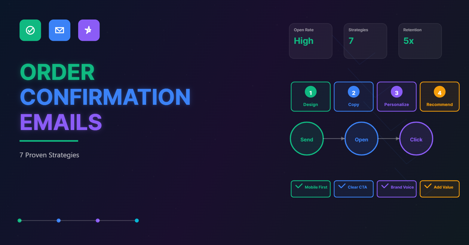
In the world of Ecommerce, Order confirmation emails are undoubtedly one of the most important emails in marketing campaigns.
Yes, With order confirmation emails you can achieve high deliverability and scalability. It also gives an additional opportunity to engage users with more information.
So, your order confirmation email is an excellent chance to grab your customer’s attention. It is also crucial for retaining customers. Because, acquiring a new customer costs five times as much as retaining an existing one, so anything you can do to keep an existing customer is a huge benefit.
Also the order confirmation email has the highest open and click-through rates in the ecommerce industry.
With all this in mind, it’s clear now why order confirmation emails deserve your complete attention.
What is an order confirmation email?
An order confirmation email is an email sent to the customer once he/she places their order in an Ecommerce store. It includes the order details: the product, the amount spent, delivery date, and address.
A good order confirmation email entices the buyer’s interest, clears up ambiguity, and sets the stage for a fruitful relationship with your customers.
And order confirmation emails are considered to be the one of the most valuable messages.
Let’s look at some creative and powerful ways to send order confirmation emails. We’ve also included order confirmation email templates to encourage you to get started on your order confirmation email.
1. Use an Eye-catchy design
When it comes to design, there are no clearly defined guidelines for order confirmation emails. They give email marketers a lot of leeways, allowing them to let their imaginations run wild.
But, keep these best practices for your confirmation email template in mind to come up with something eye-catching and high-converting.
- It should be consistent with the company’s brand. Always provide your logo so that customers can quickly recognize the brand. You can try a free logo maker to create quickly or use logo design services to design your logo. Make it an extension of your website and social media accounts by using similar colors.
- To make it more appealing to the eye, use graphical elements, illustrations, picture backgrounds, and a few bright icons can turn an order confirmation email into an authentic storytelling experience.
- Add actionable CTA’s. To set them apart from the text, use contrasting colors.
- Make it fully responsive, mobile-friendly, browser-compatible, email reader compatible.
Even though confirmation emails are sent automatically, they should not be bland. They should be tailored to your brand identity to drive conversions and generate leads.
Take a look at the Dollar Shave Club’s order confirmation email with an eye-catching design.

Dollar Shave Club‘s email makes excellent use of its wood board background. The unique background with a transparent header draws attention to their logo and welcoming copy; once again, clear and concise.
Another excellent example of a good design is the email below from Fat Brain Toys.

Fat Brain Toys email may not be visually captivating, while its creativity more than compensates. It has excellent branding. It also includes all relevant order details to find the information one seeks.
3. Make your Copy Rich
Emails have become overburdened with information. However, by sending clear, brand-specific messages, you will stand out in an overcrowded market.
Even if your emails are addressed to real people, They should ideally be relevant to the current purchase or the customer’s purchase history.
Write your emails as if you were speaking directly to your customer over the phone or in person. That is precisely how confirmation emails should be written.
Before you finalize your copies, have someone else read them. They will give you helpful feedback on your tone, choice of words, and other decisions because the most minor details can make a big difference.
You can also include CTAs that direct customers to news and announcements, new content such as blog posts, or even offline events in which your company participates.
Take a look at Boden’s email below.

Boden’s email design will definitely catch people’s attention and stand out in their inboxes.
This email from Zulily is another excellent example of building excitement with a copy.

Zuily email starts with an appealing message to the customer with enthusiasm. It simply shows you can also build excitement in your receipt emails by adding a clear call to action button, “track my package.”
3. Personalize
There are many ways to personalize your email campaigns beyond the “from” name and subject line to make them more relevant to customers.
You can use a custom field to store your customer’s information and then use it to personalize the campaign.
You can even adjust the pictures in your email marketing campaigns to better appeal to specific customers.
To make the whole campaign more enticing to your audience, you can tailor the deals using their demographics.
Take a look at this Polaroid order confirmation email.

Polaroid’s order confirmation email has an effective brand tone.
4. Include product recommendation
Firstly, Build a creative and comprehensive environment to introduce your products in your order confirmation emails.
Avoid phrases like “buy now” and “purchase this product.” You don’t want to give the impression that you’re just interested in making a sale.
Your customers will be pleased if your confirmation email offers them something valuable, and they will be more likely to click through on your CTA.
Order confirmation emails are the perfect opportunity to make more sales.
Take a look at this email from Amazon.

Amazon’s confirmation emails always include a “Recommended for you” item below your initial purchase. It’s subtle but just effective enough to generate another sale.
Another excellent example template for your WooCommerce store.
This order confirmation email entices the customers with “Track the order” Call to action at the top. It also includes a “Newest items” section at the bottom to attract more sales.
5. Maximize the Return on Referrals
If you sell your products online, you may find this to be very useful in building your relationship and reputation with customers.
Order Confirmation emails are an excellent way to make your customers feel more connected to your brand.
You can offer a reward or coupon for a future purchase in your confirmation email.
For example, you might give a $20 discount on one future purchase for every customer’s referral. You could also offer the same discount to the individual who refers the customer, making it a win-win situation for everybody.
This, once again, creates a sense of urgency and has the chance to increase conversion.
Look at this order confirmation email for your BigCommerce store.
Use this email template to brief referral promotions in your order confirmation emails to encourage your customers to share with friends.
6. Make Shopping More Exciting
Like referrals, offers and rewards are enticing to the customers. With a reward, you can spice up your order confirmation emails. Also, you can give your customers a reason to open your email and respond to your CTA.
The Reward could be a voucher, discount code, a free subscription, or anything else you value. But, always try to consider something you’d take advantage of if you were the customer.
Again, the intention is to make your recipients feel glad.
When you reward them for reading your email, as a consequence, they will choose to reward you with a future purchase or a referral, which is the best compliment of all.
Here take a look at this order confirmation email from Gilt.

Gilt creates a sense of urgency and encourages shoppers to act real soon. It also includes images of recommended products at the bottom of the email to make shopping relatively easier.
7. Promote Movements
Delivering a crucial message in an order confirmation email makes your customer feel that their purchase supports something worthwhile.
This will give your customers a happy feeling about shopping online and help people’s lives.
Making your customers happy with their products even before they arrive will make them feel good about their purchase, including something more significant.
Here, there is no upsell or additional call to action. Simply a thank you note for being a part of their cause.
Look at this order confirmation email from Toms.

Toms email makes you feel as if your purchase is supporting something significant.
Looking to get started
We want to make it easier for you. Create quick and high-converting order confirmation email templates with BayEngage, an excellent tool for your email marketing campaign. You can build a completely personalized order confirmation email template without any coding or design skills.
It gives you more flexibility in the look and feel with its more than 250+ templates. You can easily create a unique order confirmation email template that promotes your brand and speaks directly to the target audience.
Conclusion
Order confirmation emails are a bonanza, but only a few e-commerce brands are taking advantage of them.
Now, you would have understood that order confirmation emails are all about purpose and creativity. One way or another, this email receipt will make the customers feel more valued than a regular one.
What strategies do you use in your order confirmation emails?


