Celebrated American cartoonist, humorist, and journalist Frank McKinney Hubbard said, and I quote “The hardest thing is to take less when you can get more”.
Year after year, businesses and customers alike anticipate the holiday shopping. Today, with the majority of retailers heading online, the urban consumer culture is all set to disrupt the conventional shopping behaviors. Cyber Monday: a retail holiday that concludes the Thanksgiving – Black Friday shopping weekend, presents remarkable opportunities that add massive value to the consumers. While consumers seem to get the most benefits, Cyber Monday brings enormous profits to the e-commerce industry as well. According to a report by TechCrunch, shoppers spent a whopping $9.4 billion on Cyber Monday 2019, which surpassed even the $7.4 billion that was spent on Black Friday a few days before. This is a 15% spike from total spend the year before, bringing up Cyber Week’s total revenue share to 18% year-over-year.
Now, pardon me for being the bearer of bad news: like every other business opportunity, there are winners and losers in the Cyber-Monday retail game as well. It doesn’t matter how qualified and superior your products are, it’s all for naught if your communication strategies are not up to the mark. In this article, we’ll delve into everything you need to know about how email marketing design aids successful marketing communications. Use these tips and our example Cyber Monday email templates to capitalize on this year’s one of the most-awaited holiday events.
Does Email Marketing Still Work in 2025?
Many marketers and advertisers play down the effectiveness of email marketing as they fantasize about the so-called “quick impact” of social media advertising. Anyhow, studies have shown that email marketing is outranking popular marketing channels like social media, PPC, and SEO. The success of email is the return it offers. As per the DMA report, For every $1 you spend on email marketing, you can expect an average return of $42. Not just that, in 2019, over 3.9 billion users used email for various reasons. This figure is set to grow to 4.3 billion users in 2023. Now, the question here is, if your customers are using it regularly, doesn’t email the best medium to reach them? I will leave it to your discretion.
Great Email Design Does Make a Difference
With great potential comes fierce competition. With more than 66% of businesses leveraging emails to communicate with their customers, it’s ever important that your emails stand out from the rest. While of course your subject line and preheader being responsible for getting your message opened in the first place, a good email design will act as an attention hook and keep the recipients committed to your goal.
Your email design is also a great way to exhibit brand personality and value. Unlike a social media poster, there are a lot of possibilities in an email to experiment—like different typography, colors, and graphics.

Now, the key is to know what’s enough and not to overdo. If your Cyber Monday email template is overloaded with graphics or large images, it’s a guaranteed, one-way ticket to the recipient’s junk mail folder. User-friendliness is another factor you need to focus on. Make your email design intuitive, so that it’s easy for them to quickly scan the key points.
8 Tips to Rock Your Cyber Monday Marketing Campaign
Put customers at the heart of your design; that’s the starting point. When it comes to designing an email template, you can’t disregard your customers, under no circumstances. Delays are dangerous, so let’s get down to business.
Figure Out What Kind of Email Template Works for You
The first and most important aspect of your Cyber Monday email marketing campaign is determining the type of email template you want to use. While part of it depends on your customer personas, the decision should also consider your brand’s personality, values, and the type of products you’re selling. Check this Cyber Monday email from Udemy.

This email from Udemy is clean, has a clear design element that doesn’t complicate your email campaign or take away from your sales message. And the part that showcases their top courses isn’t random picks at all. They are carefully chosen and backed by data. Also, Udemy incorporated a countdown timer along with bright colors and an effective copy. This happens when you effectively create a website like Udemy.
Be Creative With Your Cyber Monday Email Theme
Unlike other holidays, Cyber Monday doesn’t have timeless characters, special color codes, or tradition. However, this lack of direction can sometimes be a blessing in disguise, for it gives you the creative freedom to come up with an original theme.

This email from Fossil better represents the idea of how a Cyber Monday email should look; retro and innovative. The theme that Fossil followed isn’t complicated. It’s easily comprehensible to any millennial or gen z shopper and bulletproof to ignorance. Exploring the cyber aspect of Cyber Monday is not the worst idea after all. Let your inner geek out and give your email a technology-themed flair.
Emotional Design is the Way to Go
Although the key to a successful design is to help the users achieve their goals as efficiently and effectively as possible, it should also focus on their responses, which are naturally emotional. Users associate emotions with what they come across. They also have tempers, for instance, some may get frustrated easier than others. The point is that the emotional design of an email affects its success—and thus the bottom line.

Pay attention to what Boden has done with its Cyber Monday emails. The combination of a minimalist copy with a vibrant design that triggers euphoria. Again, there’s no confusion, no infinite scrolling, just delivering the message loud and clear.
Choose One Primary Call-to-action
CTAs are important in an email, for it spurs interactivity. It gives direction to the recipients, guides them towards the goal you want to achieve through the campaign. However, that doesn’t mean you should use multiple CTAs and give them equal prominence. Rather, incorporate one primary CTA — just one main thing that you would like your subscribers to do. The remaining CTAs should be “secondary” options.

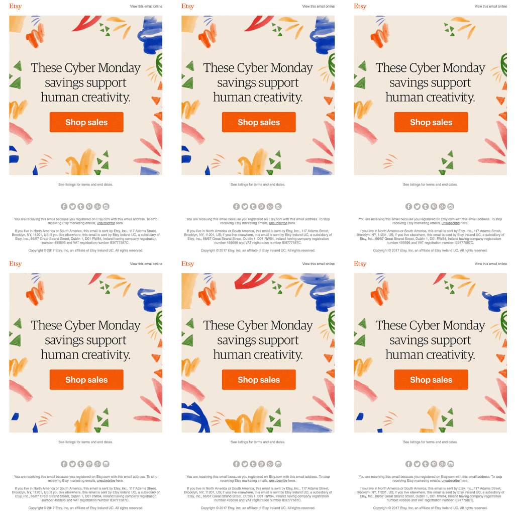
Just like Etsy’s Cyber Monday email, make it super simple for your customers to know what you want them to do next. Instead of cramming every single product and offer into the email, simply include the most important part of your message and entice them to click through.
Promise Convenience
Does convenience affect consumer decisions? Absolutely yes. Convenience is a critical factor in determining how customers make decisions about what products they like to buy, what service they prefer, where to go, and with whom to engage. From a digital business perspective, it’s about ease of purchasing an item, finding information, and even installing software if there’s such a need. Now, take a peek at this email to see how Nest successfully introduced convenience into their Cyber Monday campaigns.

The term I’d like to use to describe Nest’s approach is “interactive”. Recipients could add items to their shopping cart directly from their inbox – a brilliant feature synonymous with convenience, one that significantly improves their brand experience.
Incorporate Video
Video enhances the chance of open and click-through rates—making it the perfect addition to your marketing emails. Customers now receive more marketing and sales outreach from brands than ever before, hence, without a unique angle, the possibility of reaching and engaging your target segment is nearly zero.
Videos are indeed more engaging, entertaining, and allow you to promptly and effectively communicate with your audience. In fact, including a video in an email can improve the open rate by up to 13%.
Hack Your Conversions With Urgency
If you’re looking for a quick and effective way to optimize your conversion rates, urgency is a great place to start. Especially this tactic goes well with Cyber Monday sales– because once those deals are gone, it’ll be at least a year till something just as good comes along. There are two psychological factors at play here.
First: Urgent instances push us to act. We have a natural tendency to prolong positive emotions and reduce negative ones.
Second: Urgency elicit loss aversion. In other words, Fear of missing out (FOMO). No one likes to give up a great opportunity, especially if others are grabbing it.
Here’s an example email.

Strike the Right Balance
A promotional email should be interesting and inviting, at the same time it shouldn’t miss out on any details that you want to convey. The key is to find balance. Balance text and image content in your email. Carefully compose your images and logo, balance the elements, pick the right alignment (preferably center or left), and last but not least, test your email.

Putting Together Your Cyber Monday Email
Once you’re ready to compose your Cyber Monday email campaign, make sure you follow the aforementioned steps. Here are some key things to remember.
- Keep things sweet and simple. Adding way too many colors might overwhelm your recipients. Balance it out. Let the design talk, keep your message short and to the point. Too much text can translate into too much visual clutter.
- Being bold in your design is a great way to get your customers’ attention. Anyway, sometimes having too many bold elements in your email can be a bit of overkill.
- While static emails can engage the recipients in some ways, using gifs can do wonders. It makes your message more interactive, quickly delivers the visual information.
- Ensure your Cyber Monday email features a straightforward and effective layout that effectively organizes a multitude of details into a clean and well-balanced design.
- Divide the information in your email horizontally. This helps the reader scroll through the information with ease.
- Always test your emails. It’s frustrating when a CTA doesn’t work or a design element looks wonky. So make sure that you test your Cyber Monday emails among your colleagues who can give you helpful feedback. Test them on both computers and mobile devices to ensure that your email is compatible with all devices.
Need more inspiration? Check out our Cyber Monday email templates gallery and get your free template today.


