Abandoned cart emails are crucial in increasing your sales and improving your brand engagement. There are a number of best-abandoned cart strategies that you can leverage to get the results you want. You need to think of the best time to send the cart abandonment emails, subject lines for abandoned cart emails, set up email segmentation, and a lot more than just sending out emails!
In these dire times, when online shopping is on the rise, there’s no need to reiterate the importance of getting the abandoned cart rate under control. But, sometimes. even when everything looks under control, that might not be entirely true. So, if you think that a great targeted ad, a spick and span online store loaded with incredible products, is enough to get you enough sales.
If you still need some convincing, here are some statistics that would readily help you make up your mind.
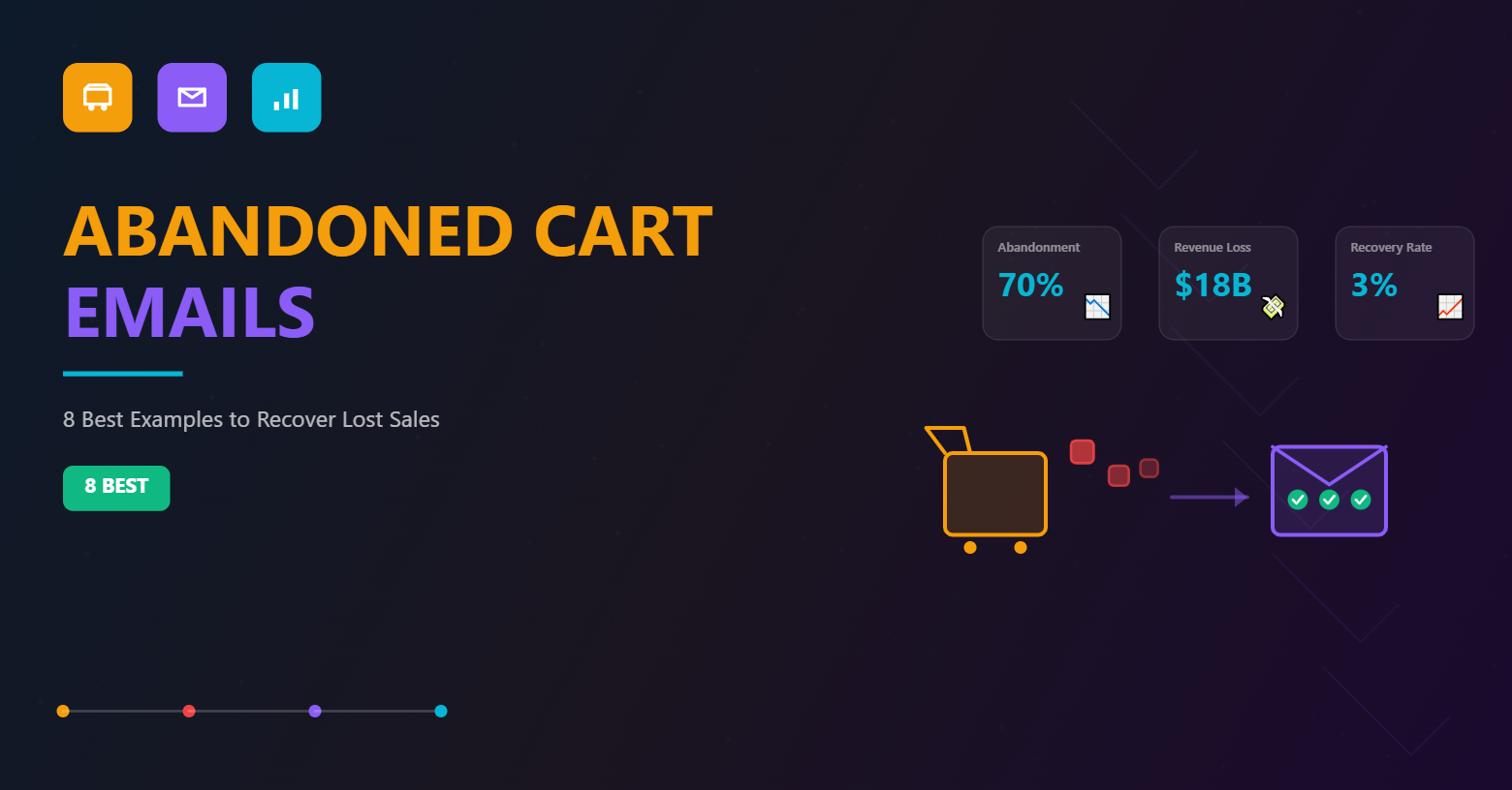
The online stores face almost 70% of the shopping carts to be abandoned, resulting in an $18 billion revenue loss annually.
This indicates that every online store is at the risk of losing 7 out of 10 customers to certain unavoidable factors. But how do you push against such terrible revenue losses?
Abandoned cart emails is the answer.
Why do you need to send Abandoned cart emails?
Well, nothing accounts more than some statistics and facts out together as an argument. So, let’s get that straight:
Newsroom research from Adobe revealed almost 71% of the smartphone/mobile purchases are influenced by abandoned cart emails.
SaleCycle suggests that about half of all the abandoned cart emails from the retailers are opened, while a third of those clicks lead to purchases.
Most importantly, SalesCycle also found that about 3% of the total e-commerce revenue is the direct result of the regular cart emails.
BigCommerce survey shows that $5.64 is made per abandoned email on average compared to other promotional emails.
Now that you’re successfully convinced why you need abandoned cart emails, the next question would be what constitutes the best abandoned cart emails?</p
After all, properly optimized abandoned cart emails can be effective in getting your customers to immediately pick up from where they’ve left off through a personalized link in an abandoned cart email. That’s why we are here to help you.
We at BayEngage understand the importance of crafting the right abandoned cart email and here are some best emails from various stores.
Eight Abandoned Cart Emails and Lessons to Learn
If you’re new to the abandoned cart email arena, it’s always better to follow the best practices employed by some of the best brands and steal like the best artist. So, let’s get started with the inspiration and the lessons that you learn from it. Let’s do this.
1. Kill It Like Amazon
Surprising, right? Even the world’s largest online retailer doesn’t forget to take advantage of the abandoned cart emails. And their cart email is simple and works out well for all of their stores. Amazon made sure to keep two factors in mind – frequency and timing while sending the abandoned cart emails. After all, picking up the right subject line and offering discounts are still secondary when compared to these two.
Moreover, Amazon is also the boss of cross-selling and upselling. Although they stick to simple messaging, they don’t forget to make it effective. They also include user-generated content like reviews to establish credibility by leveraging social proof. Plus, they also send other products related to the customer’s search results to build a sense of scarcity.
Example 1a:

Example 1b:

Hits:
- A simple abandoned cart email that is straightforward and is true to its message.
- The email lets you pick up from where you’ve left on the website.
- It also includes the product photo abandoned in the shopping cart to remind customers about their wishes.
- The email also includes a compelling CTA that takes the customers straight to checkout to complete their purchase.
Misses:
- If you look at the abandoned cart email’s bottom, it is an utter mess with all the links from different products. So, avoid putting too many links and keep the cart email design clean with a highlighted CTA.
- This abandoned cart email from Amazon doesn’t use any incentive to entice customers, but that approach works for Amazon. But not necessarily for your small business. So, try to put in some discount deals or other incentives when a customer completes the purchase.
2. Hit It Like – Asos
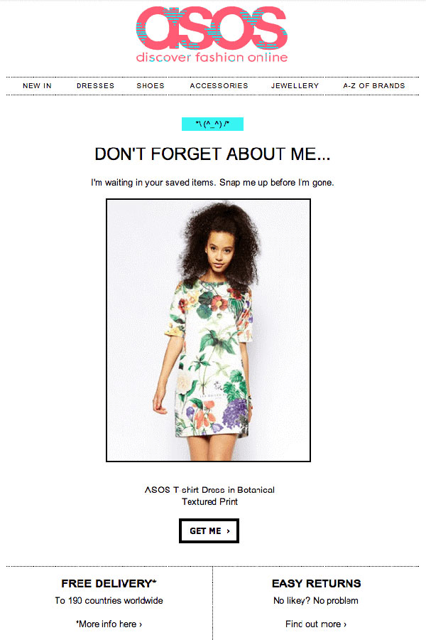
Some abandoned cart email templates from a few brands are just so compelling that there’s no need to beat around the bush. This abandoned email template is only one such example. Let’s get straight into what makes this simple abandoned cart email from ASOS so good.
Hits:
- One thing that definitely helps brands to keep up is brand identity. This brand ASOS had certainly nailed the brand recognition with this abandoned cart email.
- The messaging is also relevant, with some playful humor on the side, in the copy.
- This email also includes the item picture to remind the shoppers and entice them to make the purchase.
- It also includes an incentive for free delivery and easy return policies that increases the odds of growing sales.
Misses:
- Honestly, there is not one thing that we would like to change about this email.
So, this email template can work as a big-time inspiration for your next abandoned cart email.
3. Personalize It Like American Eagle
Another effective strategy is to personalize the email according to customers and products. And, nothing works the best way than incorporating personalization in your abandoned cart email. You can get hold of relevant data to put forward this in your strategy and gain valuable traction. An effective way to personalize would be to offer discount deals for a selected high-value shopping cart to showcase any product left in the cart right within the subject line! Well, American Eagle has made use of it!

Hits:
- The subject line of the email is on-point. It clearly states the product that the customer had left in their cart.
- The copy used in this abandoned cart email is crisp, effective, and creates a sense of emergency within shoppers.
- American Eagle also uses the product as the hero image to entice customers for all the right reasons.
- The highlighted CTA right at the end of the email also makes a lot of difference.
Misses:
- The email misses out on including any form of social proof to establish credibility.
- It also doesn’t showcase any other products other than the hoodie left in the cart.
4. Showcase Elegance Like No Other With TargetBay
This customized abandoned cart email template is perfect and is just an elegant touch that you would need for your ceramic/clay store. The layout of the template successfully can help you achieve some real high conversion. The email also gives the shopper to explore more before dipping their toe and making a purchase. This abandoned cart email template is all you need to succeed and rake up sales.

Hits:
- This template is elegant and straightforward, with some great visual consistency that is sure to grab eyeballs.
- The big and bold CTA, right at the center, helps the shopper to get back to their abandoned cart quickly without wasting any time.
- The tailor-made design layout is perfect to showcase your ceramic studio and walk the customers through the product-making process. These details will help you to increase the trust quotient.
- The bottom of the email also includes the item that the customer left behind to remind recipients of what they are missing out on in the first place.
Misses:
- Well, there is not a lot of space for your copy to shine. So, it’s essential that your copy is well-written to stand out with such an elegant design.
Still, many details in the email point this email out as a great marketing package. Overall, it’s a great way to leverage the power of cart abandonment email.
5. Grab Eyeballs with This BayEngage Email
This tailor-made email template is all you need to crush your cart abandonment rate. The elegant template is an excellent way to scale up your marketing game. This well-crafted and designed abandoned cart email template attracts the right customers and meets your business goals.
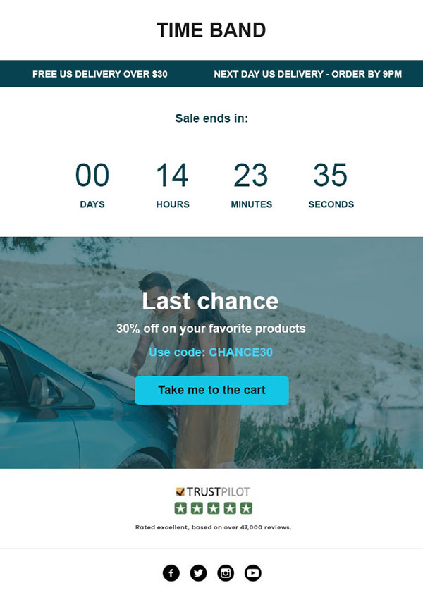
Hits:
- The eye-catching brand details on the cart email help you to grab customer’s attention.
- The timer used in the email template will nudge your shoppers to complete the purchase and increase sales.
- The copy is short and straightforward, with a link that takes the customers back to the place from where they had left.
- The “Take me to the cart” CTA is amusing and is a deliberate attempt to get them shopping.
- The use of a discount code in the email looks to appeal to the customers to finish shopping.
Misses:
- This template lacks social proof that would have helped you gain better traction.
Overall, there’s a sense of fun and personality, which really appeals to make it a great cart abandonment email to be used.
6. Tailor-made Abandoned Cart Email For Your Online Bag Store
No one likes to bear the burden of increased abandoned cart rates. Thus, it’s essential to have a killer abandoned cart rate on board, or else you might end up in a severe loss of sales and revenue. This custom-made abandoned cart email template pulls the right strings in a customer’s mind.

Hits:
- This email template very clearly showcases the exact products the customers had left behind in their cart.
- The beautiful photographs perfectly align with your brand to create brand recall.
- The positive reinforcement through the persuasive copy appeals wonderfully to the shopper’s vanity.
- Lastly, you can’t miss the prominent CTA that certainly gets the customer’s attention.
Misses:
- Well, we don’t have a lot of details to point out that needs change.
You can get hold of this template here.
7. Force, You Must Use Of Baby Yoda by TargetBay
Well, can anything ever overshadow Baby Yoda? Not really, right? So, use the force of abandoned cart emails to reap the benefits of this bonus marketing opportunity. This template has all the right elements from an amazing hero image, persuasive copy, and an eye-catching subject line. So, if you want to put a pop-culture reference and win some engagement from your customers, then this is it. After all, who doesn’t like the cuteness-overloaded Baby Yoda?
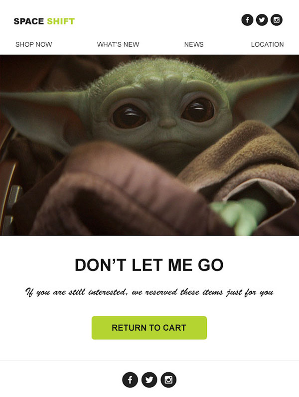
Hits:
- Pop-culture reference always works wonders, and here the inclusion of Baby Yoda makes it all the more delightful.
- The copy is cute: “don’t let me go” is sure to melt anybody’s heart.
- The underlying humor throughout the copy is encouraging enough to grab attention from readers to complete their purchases.
- Lastly, you can’t miss the highlighted CTA, right in the middle of the email.
Misses:
- This email template lacks personalization, and a little more would have made it all the more wholesome.
- You can also try to add some more relevant product lists to get the purchase rolling.
- This email template is too minimal, and little more elements would be significant.
Either way, this abandoned cart email brings in fun , reawakens your shopper’s attention for good, and rakes up sales.
8. Bark it Like Barkbox
Dogs and cuteness are all you need to pace up your abandoned cart email strategy. This real-life marketing inspiration from Barkbox is an excellent example to pick elements from that would help you stand out in a crowded inbox. Besides bringing fun to the table, this email also brings in the information that is sure to get your shopper’s attention ticking.
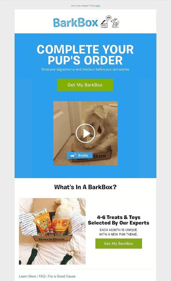
Hits:
- The use of an excited dog receiving the order in the form of a GIF is guaranteed to get your shopper’s attention
- This email also doesn’t fail to remind recipients of what they can expect in a typical Barkbox.
- The cute copy “show your dog some ruv” is just what you need for your emails to get all the love and attention.
- The Barkbox abandoned cart email includes two calls to action (CTAs), right at the top and bottom of the email, to make it easier for the customer to choose.
- Lastly, BarkBox also includes a cart expiry warning to trigger urgency, another old school marketing method.
Misses:
- We feel that a little personalization in the email would have made it more effective and help make better sales.
This template clearly incorporates personality into your email, which will definitely help you get close with your shoppers.
Final Thoughts
Abandoned cart software can make your sales. If you are quick to strategize and come up with an effective solution, you would be able to set your sales on fire. And, if you’re still in a dilemma, here’s a quick round-up to perfect your abandoned cart emails! Check out this to get some major inspiration and learning!


