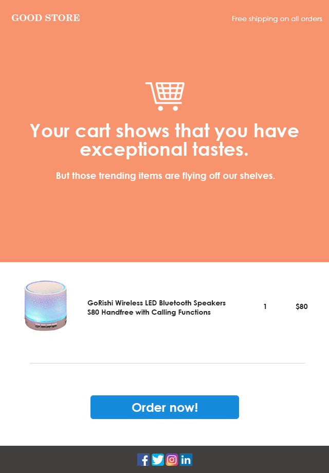
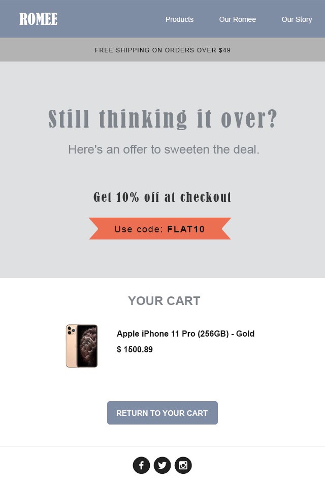
Yes, abandoned cart email templates are as important as email content and product images. But before we dive into the fool-proof abandoned cart email templates, you need to be prepared with the best-abandoned cart email strategies and explore powerful Abandoned cart software to execute what you learn.
Running an online store is no easy task. An eCommerce merchant has multiple challenges to overcome on a day-to-day basis. Right from the initial setup to the marketing efforts to gain more customers — all this hard work will definitely bring in good returns in the long run.
But.
One small issue – often overlooked – can really hamper the number and value of these gains.
With the competition growing at breakneck speeds, customers are spoilt for choice. They demand the best quality, services, and deals every single time they shop online. And when the new-age consumer sets out to shop, there’s a huge chance ( about 79.17%, in fact!) that they will be abandoning their carts. This number translates to about 3 out of every 4 shoppers abandoning their carts, leading to over $18 billion worth of revenue loss.
Let these numbers sink in.
It can be pretty frustrating to see traffic increase while the conversions remain stagnant. But don’t worry. We’ve got you covered. We’ve already created an insightful guide to creating the perfect abandoned cart email. Right from the subject line to the body content and images – but one tiny detail needs your utmost attention – the abandoned cart email template.
Why is an Abandoned Cart Email Template Important?
Having a stellar copy and attention-grabbing imagery is key for a successful abandoned cart email. But then there is something else that eCommerce store owners tend to forget – creating the perfect email layout.
The layout is the backbone for an abandoned cart email because it ensures that the information is displayed in the best way possible and is easily readable. And the most simple yet effective way to have a solid layout is by using an abandoned cart email template.
Now, there are two ways to go about finding the right email template for your business.
The first is, creating the template from scratch. A designer can meticulously create an email template based on your business goals and marketing needs. The second option is a simpler and much easier route – using pre-designed responsive abandoned email templates available on the internet.
Either of these will definitely do the trick, but the biggest challenge would be finalizing the exact style of the template itself.
Choosing the Right Template
An eCommerce merchant can choose from a wide range of abandoned cart email templates. These templates vary based on the end goal of the email and the different components that are present in them. Let’s get into the details.
1) The Basic Layout
Before focusing on additional email components to achieve specific results, it’s important to understand the elements of a basic abandoned cart email template.
Content
Good content is paramount for any successful email. There are two pieces of content that one should focus on.
The subject line is the most important piece of content you can ever write for your marketing emails. An intriguing subject line is the major driving force behind high open rates. In fact, according to Invescpro, about 47% of recipients open an email, and an alarming 69% mark an email as spam- based on subject lines alone.
The size of the subject line is another factor to think about. Keeping the length within 40 characters keeps it optimized for mobile. Experimenting with emojis is nothing new, but it certainly plays a hand in setting your email apart from the rest. In the end, the email needs to stand out and entice the recipient to open the email.
Focus on the tone of the subject line. Instilling a sense of urgency, personalization, or incentivizing a subject line definitely improves an email’s open rate. A/B tests various subject lines to find the ones that work well for your customer base.
The body content should be short and crisp. Avoid words that may trigger spam filters. The subject line entices the recipient to open the email. But the body content seals the deal by convincing the potential customer to buy the product they had abandoned earlier.
Images
Use vibrant and eye-catching imagery. An email has only a few seconds to grab the recipient’s attention before he/she exits. Using bright colors with fun fonts and interesting images definitely catch the eye. GIFs are a great way to keep the email recipient engaged long enough for them to pay heed to the other aspects of the email. Adding an image of the abandoned product helps the recall factor and is highly recommended. But keep an eye on the file size. Image-heavy emails tend to have slower load times and/or end up in the spam folder.
CTAs
Every abandoned cart email is designed with a specific end result in mind – a successful conversion. The content and images can do the talking, but a nice bold CTA is essential to kick-start that conversion seamlessly.
Keep the CTA text short. A basic “Click here” or “Take me to cart” will do. Or you get as creative as you like. But ensure that the button is clearly visible. Another tip is to test every single link on the email and ensure no link is broken.
Support
Offering support is crucial for any eCommerce business. A lack of support may add to the number of abandoned carts. Having a strong support system in place will eliminate the communication gap. Add a link to support ( or ask the customer to respond back to the email) in case they need any support on your abandoned cart emails.
Mobile Optimization
About 3 in every 5 consumers use their phones to check their emails. So it makes complete sense to optimize your abandoned cart email to be easily readable on different mobile devices. Right from the subject lines, images, and loading time – Check the email across different devices before hitting that send button.
These are non-negotiable staples in every abandoned cart email. You can consider adding additional components to your email to push the sale further.
Looking to Reduce Cart Abandonment Rate? Get 40+ high-converting Abandoned Cart Email Templates for Free.
2) Leverage User-generated Content
Happy customers make for the best salespeople. Have rave reviews about the abandoned product from other satisfied customers? Don’t just feature them on your website. Make the most out of customer reviews by adding them to your emails.
With over 97% of online shoppers checking out product reviews before making a sale, these reviews are your ticket to boosting your brand’s credibility. Positive user reviews help the shopper understand the usability of the product and feel more confident in making the sale.
3) Discount Codes to Seal the Deal
Discount codes have always been the uncontested winner in landing the most sales – but at a cost. Literally, discount codes do help you land that sale, but not without taking a chunk of your profits. Online shoppers are now conditioned to refuse to make a sale without discount codes, and this is not a great trend to keep up in the long run.
The key to using this particular sales tactic is by striking the right balance. Learn when to hand out coupons and to whom.
4) Product recommendations to up the cart value
There’s a good chance that the shopper has already shopped the abandoned product somewhere or has simply lost interest in it. Adding recommended products to your abandoned cart email is a great way to showcase your wares and land more sales by cross-selling. The user might find something he/she likes from your recommendations. Showcasing products related to abandoned products is another great opportunity to up-sell your products.
Learning From the Leaders- Top Stores Email Teardown
Now that we have a general idea of what works well on an abandoned cart email, learning from the best’s always a great idea. Let’s take a leaf from those stores that have made a name for themselves on various eCommerce platforms.
Platform: Shopify,
Store in the spotlight: Skinnymetea
Skinnymetea is a popular store on the Shopify platform.
A bit controversial? Yes.
Do they have a great marketing strategy in place? Definitely yes.
The identical second we abandoned our carts on this site, an abandoned cart email with an attractive discount was waiting for us in our inbox. Here it goes:
The subject line:
When it comes to subject lines, Skinnymetea has tried every trick in the book.
Right from the fun content (Your lucky thing) to personalization ( adding the customer’s name) and a heavy hand with the incentivizing (15% off).
If you think they have done a good job with their interesting subject lines, Check out the body of one of their abandoned cart emails:
- The first thing that catches our eye is the clean, white background that makes the readability extremely easy.
- The first line is personal, and the content takes on a friendly tone that keeps you hooked till the end of the email.
- The body content goes on to talk about numbers: over 350,000 people across the world have used our teatox. That number alone builds up the credibility factor; how can 350,000 people be wrong about a product?
- Then comes a beautiful, short, bulleted list of the advantages of the product. This reminds you why you need this product in your life.
- Then comes the hard sales push. Skinnymetea goes beyond the usual discount code by making it time-bound. The discount code works only for 20 mins upon opening the mail. Talk about creating a sense of urgency!
- Ending with the image of the abandoned product and a nice big CTA seals the deal.
- Skinnymetea also takes this chance to promote its social media handles at the fag end of the email.
It’s evident that Skinnymetea has nailed its Shopify abandoned cart email. The email itself looks effortless, but every component and the accompanying text is well thought out.
If there’s absolutely something we would have to nit-pick on, it is the absence of a support button or maybe incentivizing the very first email. Other than that, this email serves as a great inspiration and shows why Skinnymetea is at the top of its game.
Platform: Woocommerce,
Store in the spotlight: blue star coffee
Blue star coffee is one of the top stores on Woocommerce. Let’s break down their abandoned cart email and see what they’ve got right.
The angle that Blue Star Coffee has adopted seems pretty straightforward. With a simple subject line of “Complete Your Order,” here’s the body of their Woocommerce abandoned cart email:
- No personalization. Unfussy layout, Simple, straightforward text.
- The CTA is displayed pretty early in the email, promoting both online and offline stores.
- A reminder of the abandoned products
Blue Star has proved that “less is more.” A simple email that does the trick, with no frills attached. This email makes for an excellent first email of any cart recovery email strategy. Promoting the brick-and-mortar store is a great idea.
Platform: Bigcommerce,
Store in the spotlight: LARQ
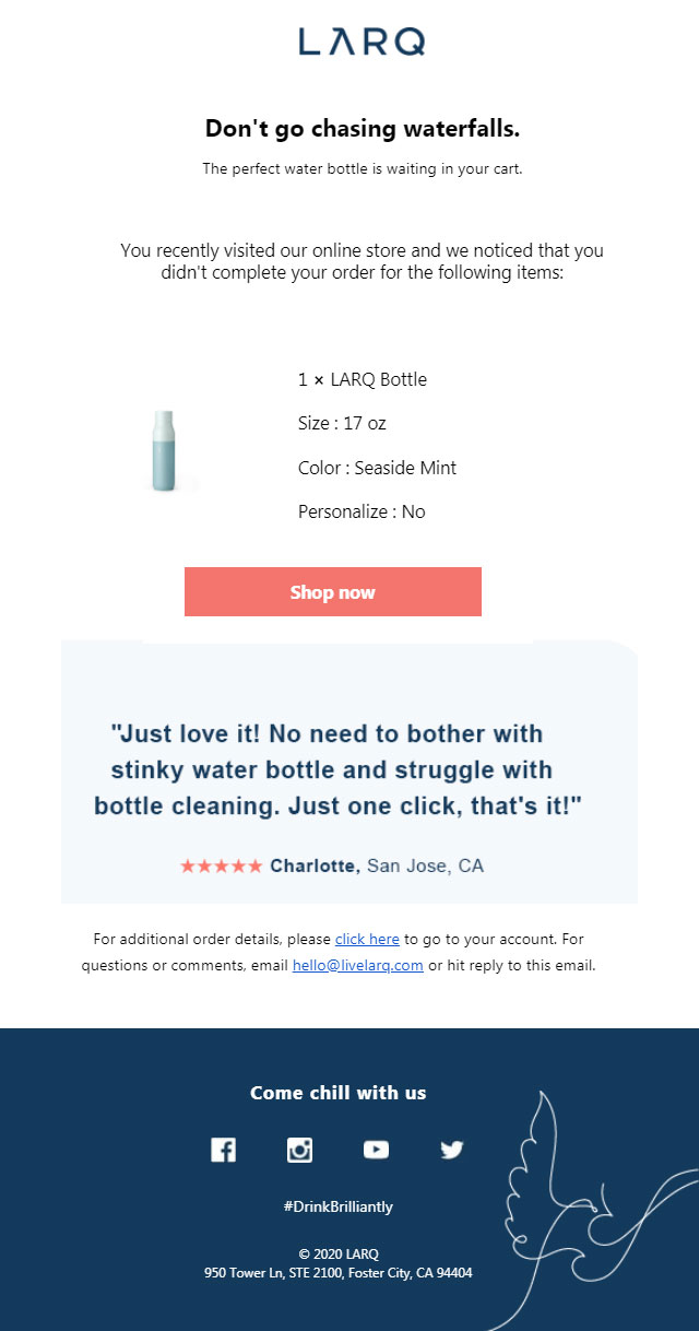
LARQ is one of the biggest players on the BigCommerce platform. Dealing with “the world’s first self-cleaning water bottle,” Larq definitely has a product that stands out on its own. But no business is immune to cart abandonment, and LARQ has a winning cart recovery email in place.
The subject line is simple. “ Complete your purchase at LARQ.” Though similar to the one of Blue Star Coffee, adding the name of the brand to the subject line definitely helps with the recall value.
Getting to the body content:
- Similar to Skinnymetea and Blue Star Coffee, LARQ too has opted for a clean, white background with easy-to-read text
- The opening line (Don’t go chasing waterfalls) and the rest of the content are quirky and completely unexpected. This line holds its own in grabbing the attention of the reader and holding on to it till the very end.
- A reminder of the product and a clear CTA button in a bright color – something that no great abandoned cart email misses out on – are displayed close to the top
- A short, positive user review with the user’s details ( name, location) makes the review sound legit and makes the product seem really useful and desirable.
- ARQ has capitalized on something that the other two giants have missed out on – support. LARQ ends the email with another CTA that leads to the cart and provides support.
- Like skinnymetea, LARQ did not miss out on promoting its social media handles at the end of the email
Platform: Magento, Store in the spotlight: S’well
Next to skinnymetea, S’well had the most emails in its cart recovery email strategy.
S’wells’ subject lines focused on offers (“new offer unlocked for your items”) and creating a sense of intrigue( “Your order status”).
Though the subject lines may seem simple, the body content is anything but. With colorful images of its products, S’wells emails thread the fine balance between clean and gaudy.
- The background is clear with pops of brightly colored S’well products ( this also helps to cross-sell!)
- “More ways to use less” indicates the environment-friendliness of the product
- S’well hits it right on the first line. No personalization. No funky content. But a straight-up incentive of a discount and free shipping.
- A bold CTA, which is crucial to any abandoned cart email template
- A reminder of the abandoned product
- S’well took a chance to promote other products in its abandoned cart email. Even if the user loses interest in the abandoned product, he/ she can easily check out what S’well has in store right from the email
S’well has taken small yet significant steps to make it stand out. If you ever want to promote your other products without being salesy, learn from S’well.
HTML Vs. pre-designed templates
We’ve learned about what goes into an abandoned cart email template. But how do we go about creating it? As discussed earlier, you can either go the easy ( yet very effective!) route by choosing a readymade, responsive email template or hire a designer to do the job for you. Here are some pros and cons so that you can make an informed choice.
HTML templates
Pros:
1) Unique to your business
2) The designer does all the work for you
3) Great way to build brand recognition
4) Can be created to your specific requirements
Cons:
1) Pricey
2) Time-consuming process
3) A similar result to using a pre-designed template
Pre-designed templates
Pros:
1) Less thought work involved
2) Can be tweaked to suit your business
3) Responsive – no need to optimize
4) Efficient and effective
Cons:
1) Not unique to business ( unless customized)
2) Basic coding skills required
Closing Notes
Well, we can go on and on as to why you should plan out a proper abandoned cart email template before considering the content that goes on it. But as we all know, no sturdy building was ever built without a blueprint! So draw inspiration from the amazing templates on this blog, and get started!
Do you have any other ideas that make your abandoned cart email rake in conversions? Share your knowledge with us! Shoot us a comment!
And if you’re on the lookout for responsive, easy-to-use email templates, check out our wide range of email templates here.


