⭐ Quick Summary
🖱️ Multiple CTAs dominate designs: 604 emails used two or more calls to action, highlighting modular, product-forward layouts that give several paths back to purchase.
📈 Design density peaks early: Average CTAs rise from 2.52 in Email 1 to 2.77 in Email 3, then simplify materially by Emails 6 and 7.
🎁 Offer timing follows two peaks: Offers are most common in Email 2 at 42.3% and Email 5 at 44.4%, with a notable dip in Email 4 at 23.8%.
🏷️ Industry patterns matter: Visual-heavy categories like Beauty and Fashion benefit from grids and multiple “Shop Now” buttons, while Petcare, Baby Products, and Food & Beverages perform better with tighter, minimalist layouts.
🔐 Sender identity is a trust signal: “Support” outperformed “Brand” and “Team” as a sender name, making it a smart test for mid-to-late sequence messages focused on help and reassurance.
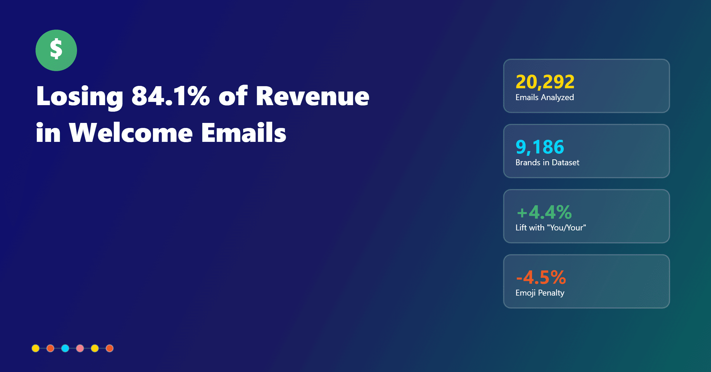
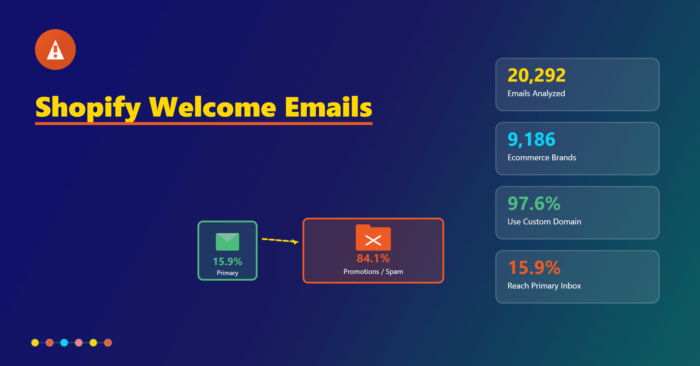
We analyzed 756 abandoned cart emails from 497 brands to find the patterns behind layouts that actually get checkouts.
The headline insight is hard to ignore: over 75% of abandoned cart email designs use multiple CTAs, a strong signal that modular layouts with product grids, banners, and recommendation blocks dominate high-performing flows.
This guide translates that dataset into a practical blueprint for abandoned cart email design. You’ll see where to press on visuals versus copy, when to add offers, how sender names impact trust, and how to balance short and long messaging.
The result is a measurable plan for designing a compelling abandoned cart email across the whole sequence, not just the first touch.
Snapshot of What Winning Abandoned Cart Email Designs Look Like
Across the 756 emails, the distribution of CTAs reveals a clear trend. Single-CTA emails accounted for 147 sends.
Two CTAs appeared in 346 emails, three CTAs in 121 emails, four CTAs in 57 emails, and a combined 133 emails contained between five and twelve CTAs.
In total, 604 emails used two or more CTAs. That means most cart abandonment email design choices lean into multiple calls to action and multi-block layouts.
This is more than a stylistic preference; it hints at the rise of modular design.
When marketers add product carousels and cross-sell blocks, they naturally add tiered CTAs like “Return to Cart,” “Shop Now,” and “Explore More.”
In practice, abandoned cart email designs that surface the abandoned item, a few relevant alternatives, and a help or support pathway outperform flat, single-message layouts because they match a broader range of buying intents.
More Abandoned Cart Email Marketing Resources for You
CTA Placement by Sequence Stage and Design Density
Average CTA counts change meaningfully as you move through the flow. Email one averages 2.52 CTAs, email two averages 2.70, and email three averages 2.77.
Email four drops back to 2.52, and email five lands at 2.33. By email six and seven, the average typically contracts to around 1.5 CTAs, signalling much simpler layouts late in the journey.
This pattern shows that early messages carry more design weight. The first three emails are the moment to use a hero plus cart module, relevant recommendations, and a support-path CTA.
It’s the right time for your primary “Return to Cart,” a secondary “Checkout Now,” and a soft “Need Help?” or “See Reviews.”
As intent fragments and the audience narrows, later emails should simplify, reduce visual noise, and focus on a single primary action.
Abandoned Cart Email Playbook
Turn abandoned carts into revenue with plug‑and‑play recovery flows, timing templates, and copy frameworks for ecommerce brands.
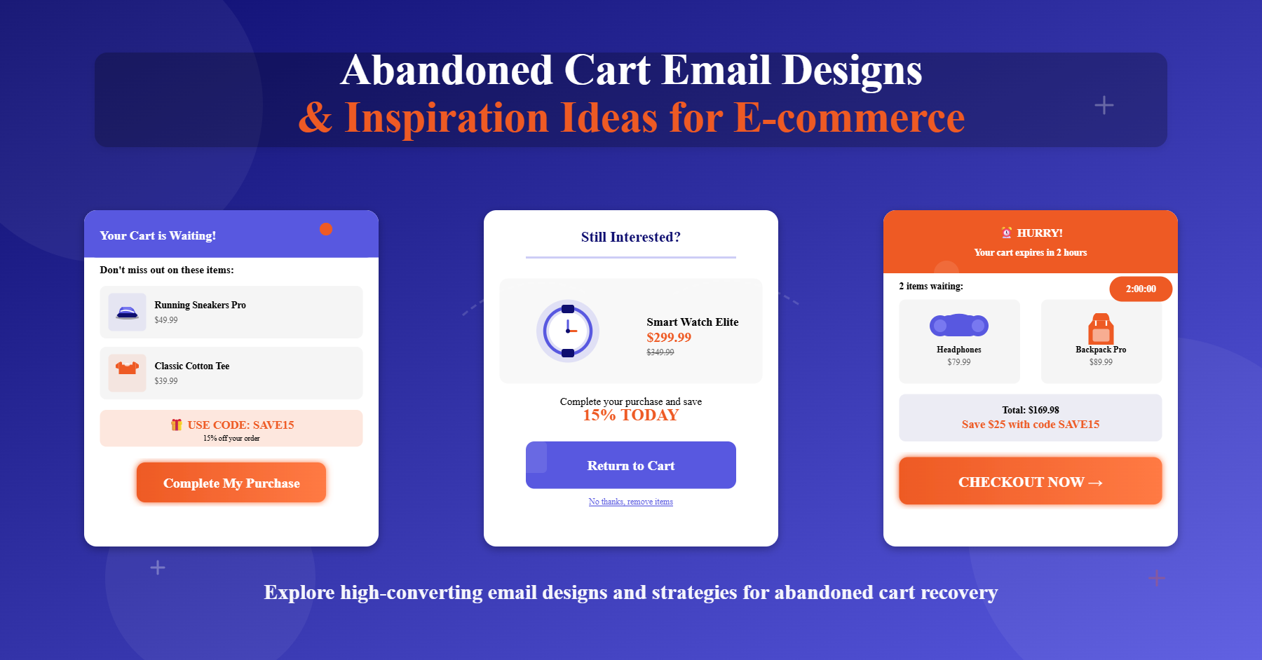
How to structure CTAs across the first three emails
In email one, prioritize speed and clarity. Use a strong hero line that references the product left behind and a clear “Return to Cart” CTA above the fold, supported by a simple help option.
In email two, add cross-sells or a small recommendation grid alongside “Return to Cart” and “Shop Now” choices.
In email three, keep the cart module visible and raise social proof with “See Reviews” or “Why Customers Love This,” while keeping the primary action consistent.
How to simplify in late-stage emails
For emails six and seven, let the layout breathe. Consider a mostly text-based approach that reads like a direct note, with a single primary CTA and a discreet help path.
This shift aligns visual density with buyer readiness by reducing distractions and giving the remaining prospects a low-friction route back to checkout.
Offer Timing That Aligns With Intent
The data shows nuanced timing for offers across the sequence. In email one, 39.0% of messages include an offer.
Email two peaks at 42.3%, and email three holds at 38.3%.
Email four dips significantly to 23.8%, then email five jumps to 44.4%.
The shape of this curve suggests two windows where incentives are most common: early-stage nudges to jump-start conversion and a later-stage push for holdouts.
To operationalize this, test a modest incentive in email two or three, such as free shipping or a small percentage off that won’t degrade margins. Make email four value-forward instead of discount-heavy by emphasizing benefits, fit guides, or care tips.
For email five, escalate with a stronger but still responsible offer or a limited-time deadline that compels action without training customers to wait for discounts.
Crafting offer messaging that doesn’t fatigue subscribers
Lead with reasons to buy first and deals second. Position incentives as support rather than default.
For example, “We saved your cart and added free shipping to make it easy” feels collaborative, while a constant discount cadence can condition price sensitivity.
Layer urgency gently with specific timelines rather than generic “ending soon” language to maintain credibility.
Which Emails Deserve the Most Design Work
Mid-flow emails tend to be the most visually structured. The highest CTA counts, and therefore the most designed layouts, appear in email two and email three.
This is the best place for modular storytelling: a clean hero, a cart block, a recommendation row, trust markers, and a support path. Together, these blocks serve different reasons for hesitation, from price comparison to fit worries.
By contrast, email six and email seven should be streamlined. With average CTAs dropping to roughly 1.5, a shift toward fewer modules and a plain background.
Emphasize urgency, trust, and help over heavy visuals. A short, friendly note from support, a single CTA, and one line about easy returns can outperform flashy designs at this stage.
A five‑email layout blueprint you can adapt
Email one should be a quick reminder that reduces cognitive load. Use a focused hero, a product image, and a single prominent “Return to Cart” CTA with a gentle help link.
Email two can carry the weight of your design with a cart module, supporting recommendations, and a standout trust element like a review snippet.
Email three is a good place to rotate in education, FAQs, and use-cases alongside the cart block to neutralize common objections.
Email four should compress back down, highlighting benefits or after-purchase support rather than pushing a deal.
Email five is your last broad push to the larger group, where the data supports a more explicit incentive backed by a clear deadline.
Industry‑Specific Abandoned Cart Email Design Patterns
Not every vertical benefits from the same level of visual complexity. Arts and Crafts, Beauty and Cosmetics, Health and Supplement, and Fashion and Apparel skew more visual.
These categories see more product grids, cross-sell modules, multiple “Shop Now” buttons, and recommendation blocks.
Shoppers in these verticals often browse visually and need side-by-side options or shade and size comparisons before committing.
Petcare, Baby Products, and Food and Beverages lean minimalist. These brands tend to depend on a tighter hero block, fewer distractions, single or double CTAs, and value-driven copy instead of heavy visuals.
The buying consideration is frequently practical, and shoppers respond to clarity on safety, ingredients, shipping, and reordering rather than a carousel of alternatives.
Matching layout to shopper psychology
Visual-first shoppers want to see the item they left, the closest alternatives, and reassurance that they’re making a great choice.
Use imagery to reduce uncertainty and add review highlights that validate taste and performance. Utility-first shoppers want brevity and trust signals.
Keep the cart module simple, outline returns and support, and ensure the primary CTA appears early and clearly on mobile.
Copy Density That Matches Intent
Short copy and long copy are almost evenly split in the dataset, with 386 short emails and 370 longer storytelling emails.
The right density depends on your position in the sequence and your audience’s friction points.
Early emails benefit from concise clarity that gets shoppers back to the cart with minimal work.
Mid-flow emails are your best chance to add education, use-cases, and social proof without detouring too far from the primary action.
Late-stage emails should remove friction more than anything else. Focus on practical objections like shipping speed, returns, warranty, or size and fit.
At this point, buyers need a reason to feel safe completing the purchase, not a brand story. A short, direct note with one CTA and a clear support path aligns with the simplified design patterns seen beyond email five.
Practical guidance for readable copy
Aim for scannable paragraphs with two to three sentences each and plain-language headings.
Keep the hero headline short, specific, and product-referential to anchor intent.
Use microcopy under CTAs sparingly to address single objections, like “Easy returns in 30 days” or “Ships in 24 hours,” rather than packing in multiple claims that compete for attention.
More Abandoned Cart Email Marketing Resources for You
Sender‑Name Choices That Signal Support and Trust
Sender identity plays a bigger role in cart recovery than most teams expect.
In this dataset, “Support” dominated with 75 emails, compared to only nine that used “Brand” and four that used “Team.”
The takeaway is straightforward: support-oriented sender names are a trust signal in abandonment flows, especially as the sequence progresses.
Testing a “Brand Support” or “Support at Brand” sender name can boost opens and make your messages feel more helpful than promotional. Align the subject line with this supportive framing, and ensure the email contains a visible help option and a clear path back to the cart.
This coupling of sender identity and content reduces anxiety and makes your offer feel like assistance, not a hard sell.
Where to place support‑style sends in the sequence
Use your brand’s standard marketing sender for emails one through three, especially if they are more visual and modular.
Introduce a support-style sender in email four or five and keep it for late-stage emails.
This mirrors the dataset’s pattern of less designed layouts later, creating a consistent, human feel as you narrow communication to people who likely have a specific question or concern.
Abandoned Cart Email Playbook
Turn abandoned carts into revenue with plug‑and‑play recovery flows, timing templates, and copy frameworks for ecommerce brands.
Why Multiple CTAs Often Mean Modular Layouts
A total of 604 emails included two or more CTAs, and these nearly always represented modular builds such as product carousels, multi-product cart modules, tiered CTAs like “Shop Now,” “View Cart,” and “Explore More,” and cross-sell blocks.
In practice, multiple CTAs create multiple doors back to purchase and capture different decision styles without forcing a single path.
The key is to maintain a clear hierarchy. Keep one primary CTA consistently styled and positioned, then use secondary CTAs to support distinct intents, like exploring alternatives or seeking help.
On mobile, ensure modules stack cleanly and that the primary CTA remains above the fold where possible.
This approach preserves clarity while leveraging the performance edge of product-forward blocks.
Measuring the impact of modular design
Track not just overall click-through rates, but click distribution by CTA type.
If “Return to Cart” drives most clicks in email one, while recommendation CTAs take over in email two and three, that’s a signal to expand or contract modules accordingly.
Likewise, if support CTAs spike in late-stage emails, elevate your help content and consider sending from a support-oriented sender name to match intent.
Conclusion
Designing a compelling abandoned cart email requires more than a single best-practice template.
The evidence points to early emails carrying more design density, mid-flow messages leveraging modular blocks and multiple CTAs, and late-stage sends simplifying to trust, urgency, and support.
Offers work best when introduced thoughtfully in email two or three and escalated with care around email five, while sender names that emphasize support can lift engagement in the back half of the sequence.
If you want to put these patterns to work quickly, a unified approach helps. TargetBay Email & SMS can launch on-brand abandoned cart flows, including modular layouts and dynamic product blocks. Pairing that with TargetBay Reviews adds credible social proof to your cart modules, while TargetBay Rewards lets you offer incentives that protect margins. Together, they create a consistent recovery experience that respects your customers and your brand.
Transparency & Disclaimer
This guide is based on an analysis of 756 abandoned cart emails from 497 e-commerce brands, collected between 1 August 2024 and 5 June 2025 through InboxEagle.com, a platform that tracks public e-commerce email campaigns.
Important context for interpretation: Reported percentages and averages represent trends within this dataset, not universal benchmarks. Results can vary by industry, audience, region, and email platform. Metrics such as inbox placement, opens, and clicks are also influenced by list quality, deliverability, and recipient behavior.
Disclaimer: All emails analyzed were sourced from third-party e-commerce brands. TargetBay has no affiliation with any brands in the dataset.
These insights are intended as directional guidance and benchmarking, not guaranteed outcomes. Brands should validate and adapt strategies based on their own performance data.