Quick Summary
📈 Set clear goals: Track conversion and close rates, and attribute revenue so you know which popups truly pay off instead of guessing across devices, pages, time, and sources for accuracy.
📱 Prioritize UX: Prioritize User Experience with scannable copy, one-to-two fields, strong CTAs, fast subtle animations, accessible controls, and visible exits to boost engagement without annoying shoppers or harming SEO on every device consistently.
🎯 Smart Targeting: Use precise display rules, frequency caps, and contextual targeting so the right message appears at the right moment on the right page, especially for mobile and returning visitors to convert.
🆎 Testing Strategy: Run a disciplined popup A/B test program, isolate one variable at a time, segment by device and page, track statistical significance, and connect subscribers to revenue for confident optimization decisions.
🔁 Thank You Flow: Finish strong with a purposeful thank you experience that reveals coupons, delivers downloads, nudges the next click, auto-closes gracefully, and feeds your welcome series in TargetBay Email & SMS automatically.
Popups aren’t the problem—bad popups are. When a popup is slow, irrelevant, or impossible to dismiss, shoppers bounce, and brands lose revenue. When it’s timely, valuable, and respectful, it becomes a reliable list-growth and sales lever. This guide distils Popup Design Best Practices so you can build popups that convert without compromising user experience or SEO.
Set Goals And Benchmarks Before You Design
Popups work best when you define success up front. Choose a primary KPI and track it consistently. For most ecommerce brands, the primary KPI is conversion rate, calculated as submissions divided by views. Layer in a close rate to understand friction, and attribute revenue from popup subscribers within a defined window to prove ROI.
Make a measurement routine, not reactive. Watch time-series trends to see how performance shifts over days and weeks. Compare results by device and page type because mobile and desktop behave differently, and intent varies by PDP, collection, blog, and cart. Segment by traffic source and geography to spot high-intent cohorts and localization opportunities.
Use a Popup Analytics dashboard that updates in near real-time and visualizes the entire funnel—from views to submissions to purchases. Variant-level performance is essential to identify winners and confirm that improvements are statistically meaningful. Exporting data to CSV and retaining historical performance lets you audit changes and keep your optimization backlog sharp.
UX-first Popup Design Principles
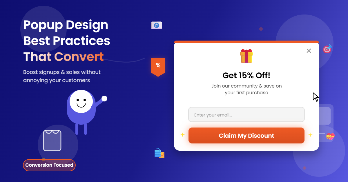
Great popups are easy to read, finish, and close. Lead with a clear value proposition in the headline and keep body copy scannable. Stick to one or two fields unless you have a strong reason to ask for more. The CTA should be action-driven, visually prominent, and consistent with the promised value.
Accessibility and speed are non-negotiable. Ensure the close button is always visible and the popup is fully keyboard-navigable with a logical focus order and ESC to dismiss. Animations should be subtle and fast—under 500 milliseconds—and never block content. Load lightweight images and avoid third-party bloat that delays first paint.
Use layout and brand to earn trust. Maintain ample contrast, whitespace, and a clear visual hierarchy. Align colors, fonts, and imagery to your storefront aesthetic to feel cohesive rather than intrusive. These pop-up best practices UX choices reduce cognitive load and increase completion rates.
More Popup Marketing Resources for You
Smart Display Rules: The Right Message At The Right Moment
Timing and targeting are the heart of popup best practices. Let visitors engage first, then show the right message with thoughtful triggers. Common triggers include time delay for homepage discovery, scroll depth for content engagement, exit-intent to capture abandoning visitors, click-trigger for proactive offers, and inactivity for re-engagement.
Context matters. Target by page or category to keep offers relevant to product interest. Distinguish new from returning visitors and adjust your approach accordingly, such as showing exit-intent offers to returning visitors and new-subscriber discounts to first-timers. Segment by device, geography, and traffic source to tailor messaging and language more precisely.
Control frequency to avoid fatigue. Start with one popup per session and cap impressions to one to three times within seven to fourteen days. Respect recent subscribers by excluding them. When multiple popups could show, apply rule priority and combine conditions with AND/OR logic so visitors see the single most relevant message rather than a collision of competing offers.
Mobile-friendly Popups That Respect UX And SEO
Mobile Friendly Popups require special care. Use responsive scaling so content stays legible without pinch-zooming. Make buttons thumb-friendly and avoid edge-to-edge layouts that trap the close control under notches or navigation bars. Prefer slide-ins or corner popups over full-screen takeovers on mobile unless the offer is genuinely high value.
Protect performance and rankings. Heavy, obstructive interstitials frustrate users and can harm SEO. Keep animations smooth at 60 frames per second and images optimized for mobile bandwidth. Keep the z-index appropriate so the popup doesn’t interfere with key navigation elements, and ensure the overlay is translucent and easily dismissible.
Always test on the devices your customers actually use. Emulate different viewports, rotate orientation, and verify that focus states, close behavior, and autofill work as intended. A responsive, respectful experience stems directly from strong launch settings and diligent device testing.
High-converting Templates And Real Use Cases
You don’t need to start from a blank canvas. Use proven templates as a foundation, then tailor them to your brand. Pop up design examples that consistently perform include newsletter signups with a clear benefit, limited-time discount offers that create urgency, and exit-intent captures for cart and checkout pages that rescue hesitant shoppers.
Go beyond discounts with specialized experiences. A feedback popup can gather quick sentiment after delivery pages or post-purchase flows, improving retention and product roadmap decisions. Survey Popups can collect zero-party data for personalization, such as size preferences or style choices, when a visitor is browsing relevant categories.
Brand alignment elevates credibility. Use your own colours, typography, and imagery to align with the rest of your site. Follow layout best practices like consistent padding, clear headlines, and balanced visual weight. For inspiration, keep a list of pop up design ideas such as mystery offers, early access signups for new drops, free shipping unlocks for reaching a threshold, or content-led offers like style guides and seasonal lookbooks.
Copy, Incentives, And Trust Boosters
Great design fails without compelling copy and a real reason to act. Offers that convert typically reduce risk or increase immediate value. Tiered discounts encourage higher average order values, free shipping removes a common blocker, and early access feels exclusive without eroding margin. Pair your incentive with concise, benefit-led copy that spells out exactly what shoppers get and when.
Reduce friction with smart microcopy. Explain why you ask for a phone number or email, reassure visitors about privacy, and state “unsubscribe anytime” near the form. Display social proof to validate the offer and the brand. Pull in review counts or highlights, ideally leveraging a trusted system such as TargetBay Reviews to showcase photo and video testimonials without extra engineering.
Design trust into every element. Avoid aggressive countdowns on first contact, use realistic urgency when inventory is truly limited, and avoid dark patterns. If you run a loyalty program, hint at points earned or perks unlocked through TargetBay Rewards to boost perceived value without defaulting to steeper discounts.
Popup A/B Test Plan And Analytics Framework
A disciplined popup A/B test strategy separates opinion from results. Define a single primary metric—conversion rate—and test one change at a time. High-impact variables include the headline, incentive, hero image, display style, trigger type, and placement. Isolate the variable to keep learnings clean and repeatable.
Segment results by device and page to avoid masking effects. What wins on a PDP may lose on a blog post, and mobile often prefers different layouts and copy length than desktop. Prevent overlapping popups so attribution remains accurate, and run tests long enough to reach statistical significance with adequate sample size per variant.
Measure beyond the opt-in. Track the full funnel from views to submissions to attributed revenue within your chosen window. Monitor close rate and abandonment to flag UX issues early. Use time-series charts to spot seasonality or fatigue, and export your dataset to examine variant performance by traffic source and geography. This is where a robust Popup Analytics layer becomes a competitive advantage.
Post-submission Experience That Drives Action
The moment after submission is your best chance to convert interest into revenue. Choose a thank you experience that fits your goal. In-popup confirmations are ideal for quick shopping resumes, while redirects work well when you want to move visitors to a tailored landing page or collection.
Display coupon codes clearly and make them easy to use. Show the code in large text, add a copy-to-clipboard control, and include an auto-apply link that preserves attribution. If you promised a download, deliver it immediately and set link expiry to protect assets. Add social sharing if it fits the campaign and invite visitors to keep browsing with a “Shop Now” or “Continue Browsing” CTA.
Control closure gracefully. Auto-close after a short delay, but never before the shopper has time to copy the code or click the next step. Track downstream actions like click-through to category pages or use of the coupon at checkout. Sync new subscribers into your welcome flow in TargetBay Email & SMS so the on-site offer extends into your email and SMS automation with consistent messaging.
FAQs
What’s a good popup conversion rate?
Most ecommerce popups convert between three and ten percent. With strong targeting, a compelling incentive, and well-tuned triggers, it is common to see ten to twenty percent or higher on specific pages and exit-intent campaigns.
How often should I show a popup to the same visitor?
Start with once per session and cap impressions to one to three times within seven to fourteen days. Use exit-intent more aggressively for returning visitors, and always exclude recent subscribers from acquisition campaigns.
How do I run a reliable popup A/B test?
Pick one primary metric, such as conversion rate, test one change at a time, and ensure each variant gets enough traffic to reach significance. Segment by device and page, avoid overlapping popups, and run the test until the data is stable.
Conclusion
Winning with popups is a system, not a guess. Set clear goals and track them rigorously, design for humans first, show targeted messages at precise moments, optimize for mobile performance, and back your choices with a steady popup A/B test program. Then turn submissions into revenue with a purposeful thank-you experience and a connected lifecycle journey. For ecommerce brands that want this entire workflow to run smoothly—from on-site capture to automated follow-up—TargetBay Email & SMS brings popups, analytics, and post-submission messaging together, with optional support from TargetBay Reviews and TargetBay Rewards when social proof and loyalty lift are part of your strategy.