Quick Summary
🆎 Evidence‑Based Popups: A disciplined popup A/B test replaces guesswork with proof, lifting list growth while reducing abandonment through targeted offers, minimal forms, and well-timed triggers across devices.
📋 High‑Intent Forms: Short, validated forms with clear error messages outperform long forms; collect one essential contact field, capture consent properly, and map hidden UTM data to unified customer profiles for segmentation.
📱 Smart Targeting Rules: Target device-specific timing for your welcome popup, add page-level rules, and cap frequency to balance conversion with user experience and protect long-term brand equity.
📊 Insightful Test Analytics: Judge tests with an a/b test dashboard that shows views, conversion rate, close rate, abandonment, time-series trends, and breakdowns by page, device, and source with 95% confidence thresholds.
💹 Revenue‑First Optimization: Optimize beyond conversion rate by attributing revenue to popup subscribers, comparing variants by revenue per visitor, and auto-deploying winners while documenting learnings for your testing backlog.
If your popups get plenty of views but few signups, you’re leaving revenue on the table. The fastest fix isn’t a redesign; it’s a disciplined popup A/B test that reveals exactly which message, timing, and form fields remove friction and increase conversions.
E-commerce brands that treat popups as a testing program—not a set-and-forget widget—grow lists faster, pay less for acquisition, and improve email and SMS revenue. The difference is not luck; it’s better hypotheses, clean test setups, and tight analytics.
What Is A Popup A/B Test (and why it matters for ecommerce)
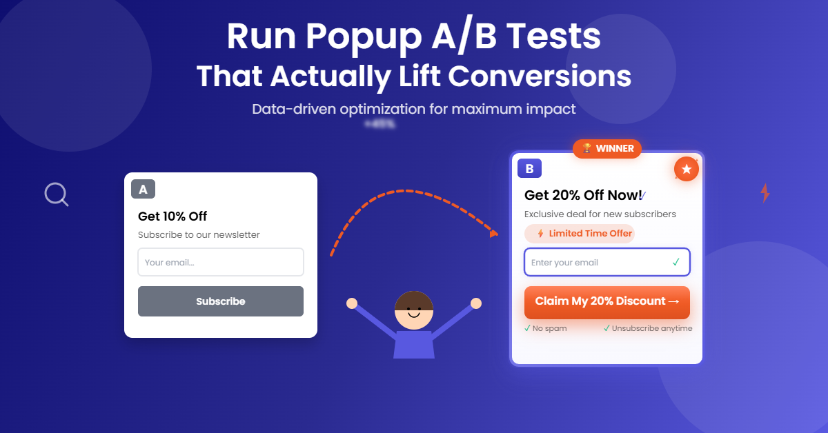
A popup A/B test is a structured experiment where you split traffic between two or more popup variants and measure which one drives more conversions under the same conditions. If you’ve ever wondered what an A/B test is, think of it as running a fair race between options—same audience, different popup experiences—so the winner is clear and repeatable.
For e-commerce marketers, the payoff is real. You lift list growth by validating the offer that resonates, reducing abandonment by trimming friction in the form, and confirming which triggers and timing work best across mobile and desktop. Most importantly, you replace guessing with data, so every subsequent popup you launch starts from a higher baseline.
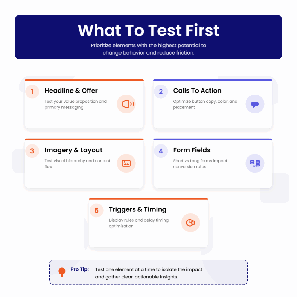
What To Test First
Prioritize elements with the highest potential to change behavior and reduce friction. Start simple, isolate variables, and document each learning so you can compound gains over time.

Headline And Offer
Lead with a benefit-driven headline and test the value proposition. Compare a percentage discount against a dollar amount, try a free shipping incentive versus early access, and experiment with social proof lines like “Trusted by 50,000 shoppers.” Keep one element stable while changing the other to attribute impact correctly.
Calls To Action
Your CTA should be short and specific. Test “Get 10% Off” versus “Unlock My Discount,” or “Join SMS Alerts” versus “Text Me Deals.” Clarity often outruns cleverness, but only a test can prove it for your audience.
Imagery And Layout
Imagery sets expectations. Test product close-ups versus lifestyle photos and light versus dark backgrounds. Try single-column versus two-column layouts and adjust visual hierarchy to draw attention to the headline and CTA without distractions.
Form Fields: Short Versus Long
Every field is friction. A lead generation popup with one required field (email or phone) consistently outperforms long forms. If you need more data, test making non-essential fields optional, and use progressive profiling later via email or SMS.
Triggers And Display Rules
Triggers change intent. Evaluate entry popups after a short delay, exit-intent popups for cart savers, and scroll-based popups for content-heavy pages. For the best timing for popup display, test 5–10 seconds versus 50% scroll on mobile, and exit-intent on desktop first visits.
Form Best Practices For Lead Generation Popups
The form is where intent turns into data, so build it for speed, clarity, and compliance. Your welcome popup should feel helpful, not nosy. Start with minimal fields, validate inputs in real time, and collect the tracking data you need invisibly.
Keep one required field—email or phone—plus an optional first name if personalization is a priority. Use client-side validation to catch email typos and support international phone formats. Clear, inline error messages prevent frustration and reduce abandonment.
Compliance isn’t optional. Include a GDPR or TCPA consent checkbox where applicable, with plain-language disclosure. Make sure consent terms are accessible and precise, and ensure opt-ins are stored with timestamps for audit-readiness.
Use hidden fields to capture UTM parameters, source, and campaign names automatically. Map every field to your customer profile, so each submission creates or updates a unified record. This keeps data quality high, prevents duplicates, and powers segmentation later.
Design matters. Keep labels visible, avoid tiny tap targets on mobile, and ensure the form loads fast. Even minor interaction delays can tank conversion rates at scale.
More Popup Marketing Resources for You
Targeting And Best Timing For Welcome Popups
Timing rules should reflect device, page type, and visitor intent. A first-time mobile visitor tapping through from social has different patience than a desktop user browsing product detail pages.
On mobile, test a 5–10 second delay or a 50% scroll trigger to let users settle in, and apply frequency caps so you don’t show the same popup again within a few days. On desktop, start with exit-intent for first visits and a short delay for repeat sessions. Suppress popups on critical pages like checkout unless your test explicitly targets cart recovery.
Page-level targeting increases relevance. Show a category-specific offer on collection pages, a size guide or fit quiz prompt on product pages, and a content-driven offer on blog pages. The more the popup matches context, the higher the engagement and the lower the close rate.
How To Set Up A Clean Popup A/B Test
Strong testing hygiene makes your results trustworthy. Create two to five variants and ensure the traffic split equals 100%. Assign one variant as the control and randomize the assignment so each visitor sees the same variant across sessions.
Define a minimum sample size before launch. As a rule of thumb, ensure each variant receives at least 100–1000 visitors and runs for a minimum of seven days to capture weekday-weekend behavior. Aim for at least 95% confidence before declaring a winner, and avoid editing copy or targeting mid-test, which resets your baseline.
QA every variant on mobile and desktop, test validation states, and verify that hidden fields, consent capture, and profile mapping are working. Confirm that analytics are logging views and submissions correctly and that revenue attribution is configured through your commerce integration.
If you’re testing triggers or timing, run separate tests to avoid overlapping rules that muddy attribution. Document your hypothesis, setup, and expected outcomes so you can evaluate results objectively.
Reading The A/B Test Dashboard
Your a/b test dashboard should surface the metrics that matter and make the story obvious. Start with views, submissions, conversion rate, and close rate to understand basic performance. Then review the conversion funnel to spot drop-offs.
Analyze abandonment and error events to pinpoint avoidable friction. If conversion improves but close rate also increases, your timing may be too aggressive. If views are high but submissions flatline on mobile, revisit field count, error messages, and tap targets.
Trends tell the truth over time. Use time-series views to expose novelty effects and check performance by page, device, and source to identify where variants resonate. Variant-level breakdowns clarify whether copy, offer, or trigger changes are driving the lift, and statistical significance indicators keep you honest about what’s actually better versus just lucky.
Measuring ROI The Right Way
Conversion rate is a helpful leading indicator, but it’s not the finish line. Tie popup signups to revenue and compare variants by revenue per visitor and revenue per subscriber. This perspective can flip a decision when a slightly lower-converting variant attracts higher-value customers.
Set an attribution window that reflects your buying cycle and confirm that orders from popup subscribers are linked by email or phone. Track subscriber cohort revenue, discount redemption rates, and unsubscribe or spam complaint rates to ensure your growth is healthy, not just fast.
Consider downstream effects. A variant that overuses discounts may inflate short-term conversions but depress margin and train discount dependency. A strong non-discount incentive—like early access or loyalty points—can create durable value, especially when paired with programs like TargetBay Rewards.
Rolling Out Winners And Iterating
Once a winner hits statistical significance, deploy it automatically and archive the test. Record the learning in a shared playbook, including screenshots, traffic splits, audience segments, and performance by device and page type.
Turn insights into a backlog. If a 10% discount beats free shipping on desktop, test whether the same holds on mobile. If shortening the form boosted conversions, test a progressive profiling follow-up email from TargetBay Email & SMS to collect additional attributes without hurting the initial signup rate.
Keep a steady cadence of small, high-quality tests. Consistency beats sporadic big swings, and each win sets a higher floor for the next campaign.
Conclusion
Popups don’t have to be annoying, and they shouldn’t be a black box. With disciplined testing, smart timing, and clean data practices, your welcome popup becomes a reliable engine for list growth and revenue, not a leaky sieve.
If you want to move fast with confidence, TargetBay Email & SMS gives you the essentials for form configuration, variant testing, and analytics in one place, plus seamless revenue attribution back to orders. Paired with TargetBay Reviews and TargetBay Rewards when you need them, you’ll build a high-intent audience and turn first purchases into repeat customers.
FAQs
How long should a popup A/B test run?
Plan for at least seven days and continue until each variant receives enough traffic—typically 100 to 1000 visitors—to reach about 95% confidence. Avoid mid-test changes that reset learning.
What’s the best timing for a welcome popup?
There isn’t one universal answer, so test device-specific triggers. Start with a 5–10 second delay or 50% scroll on mobile and exit-intent for desktop first visits. Add frequency caps to reduce fatigue.
What fields should I include in a lead generation popup?
Begin with one required field—email or phone—plus an optional name. Include a required consent checkbox where applicable and use hidden UTM and campaign fields with real-time validation to ensure clean data.


